- Welcome
- Installation
- Element Customization
- accordion
- footer
- tab
- intro-Box
- pricing table
- call to action
- team
- testimonial
- progress-bar
- contact from
- breadcrumbs
- signup/in
- button
- news-letter
- card style
- counter
- pagination
- countdown
- inputs
- video section
- parallax
- client logo
- carousel
- lightbox
- heading style
- social icon
- instagram feed
- list group
- list Style
- table
- blockquotes
- alert
- label & badge
- modal
- Helper Classes
- Sources & Credits
- Support
Introduction
Stuck shortcode web elements come up with highly creative, unique, modern UI and Bootstrap responsive multipurpose web UI pack. over 400+ shortcode web elements we have made to build your site outstanding looking. stuck is an interactive, easily customizable, highly modern UI, fast loading, lightweight, flexible, search engine optimized, efficiently managed all code, well documented and fully responsive HTML5 and CSS3 multi-purpose web elements pack. Purchase the stuck elements and make your website amazing looking.
Stuck is a huge number of handy Shortcodes which are quite powerful, flexible & easy to use. Setting up shortcodes is very easy & Self Explanatory. Here is the List of Shortcodes:
accordionfooter-lightfooter-darktabintro-box-1intro-box-2pricingcta-lightcta-bg-imagecta-darkteamtestimonialprogress barcontact formbreadcrumbssignup/inbuttonsnewslettercard stylecounterpaginationcountdowninputsinput switchvideo sectionparallaxclient-logocarousellightboxheading-separatorlabel & badgesocial-iconinstagram feedlist-grouplist-Styletable-styleblockquotestyphographyalert-style
Latest Update: 21 April 2018
By: Theme Beck
Email: [email protected]
Copyright © 2018. ThemeBack All Rights Reserved.
Installation
All the file are well organized, its so easy to work with the template. Follow the steps below to setup your site template
1. Unzip the downloaded package and open the HTML folder to find all the template files.
2. You will find the all html file and CSS folder, Fonts folder, Images folder, Js folder, Video folder.
3. In the CSS folder you will get some common CSS file and asset folder.
4. Asset folder contain all shortcode element CSS file individually.
5. Js folder contain only the jquery files.
6. Fonts folder contain essential font files for fonts.
7. Images folder contain all images of templetes.
8. Video folder contain a video file.
Include css files :
These css file must have to include like this order.
    <!--google font-->
    <link href="https://fonts.googleapis.com/css?family=Lato:300,300i,400,700,900|Merriweather:300,400,700,900|Montserrat:300,400,500,600,700,800,900|Playfair+Display:400,400i,700,700i,900,900i|Raleway:300,300i,400,500,600,700,800,900|Roboto:300,300i,400,500,700,900" rel="stylesheet">

    <!-- all fonts css -->
    <link rel="stylesheet" href="css/theme.fonts.css">

    <!--bootstrap min css-->
    <link rel="stylesheet" href="css/bootstrap.min.css">

    <!-- global css -->
    <link rel="stylesheet" href="css/global-style.css">
Include js files :
These js file must have to include like this order.
Note:shortcode-main.js file must have to include end of all js link
    <!-- jQuary library -->
    <script type="text/javascript" src="js/jquery-3.2.1.min.js"></script>

    <!--bootstrap min js-->
    <script type="text/javascript" src="js/popper.min.js"></script>
    <script type="text/javascript" src="js/bootstrap.min.js"></script>

    <!-- all jQuary activation code here and always it will be bottom of all script tag -->
    <script type="text/javascript" src="js/shortcode-main.js"></script>
Note: For Images You should upload all or specific Image files as per your need at the same directory.
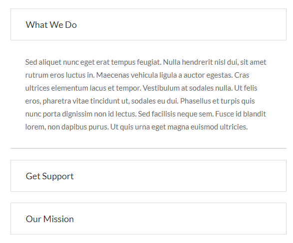
Accordion
For accordion style you have to include accordion.cssfile. You can use whole css file or you can use individual section style. We made css style, section by section individual that are well comented (you will better understand if you see code).Note: Responsive Style sheet included in this css file
Example :
Code :
    <div id="accordion" role="tablist" class="accordion_common accordion_style1">
        <div class="card">
            <a data-toggle="collapse" class="title" href="#collapseOne" role="button" aria-expanded="true">your title</a>
            <div id="collapseOne" class="collapse show" role="tabpanel" data-parent="#accordion">
                <p class="card-body color_66">your content</p>
            </div>
        </div>

        <!--card-2-->
        <div class="card">
            <a class="collapsed title" data-toggle="collapse" href="#collapseTwo" role="button" aria-expanded="false">your title</a>
            <div id="collapseTwo" class="collapse" role="tabpanel" data-parent="#accordion">
                <p class="card-body color_66">your content</p>
            </div>
        </div>

        <!--card-3-->
        <div class="card">
            <a class="collapsed title" data-toggle="collapse" href="#collapseThree" role="button" aria-expanded="false">your title</a>
            <div id="collapseThree" class="collapse" role="tabpanel" data-parent="#accordion">
                <p class="card-body color_66">your content</p>
            </div>
        </div>

    </div>
    /*-------common style for accordion section --------*/
    .accordion_common .card {
      border-radius: 4px;
      box-shadow: none;
    }
    .accordion_common .card .title {
        display: block;
        font-size: 18px;
        color: #303030;
    }
    .accordion_common p.card-body {
        font-size: 15px;
        line-height: 26px;
        font-family: "Lato", sans-serif;
    }
    /*---------style-1----------*/
    .accordion_style1 .card {
        margin-bottom: 20px;
        border: none;
    }
    .accordion_style1 .card .title {
        border: 1px solid #dcdcdc;
        padding: 18px 30px;
    }
    .accordion_style1 p.card-body {
        border-bottom: 2px solid #dcdcdc;
        padding: 30px;
    }
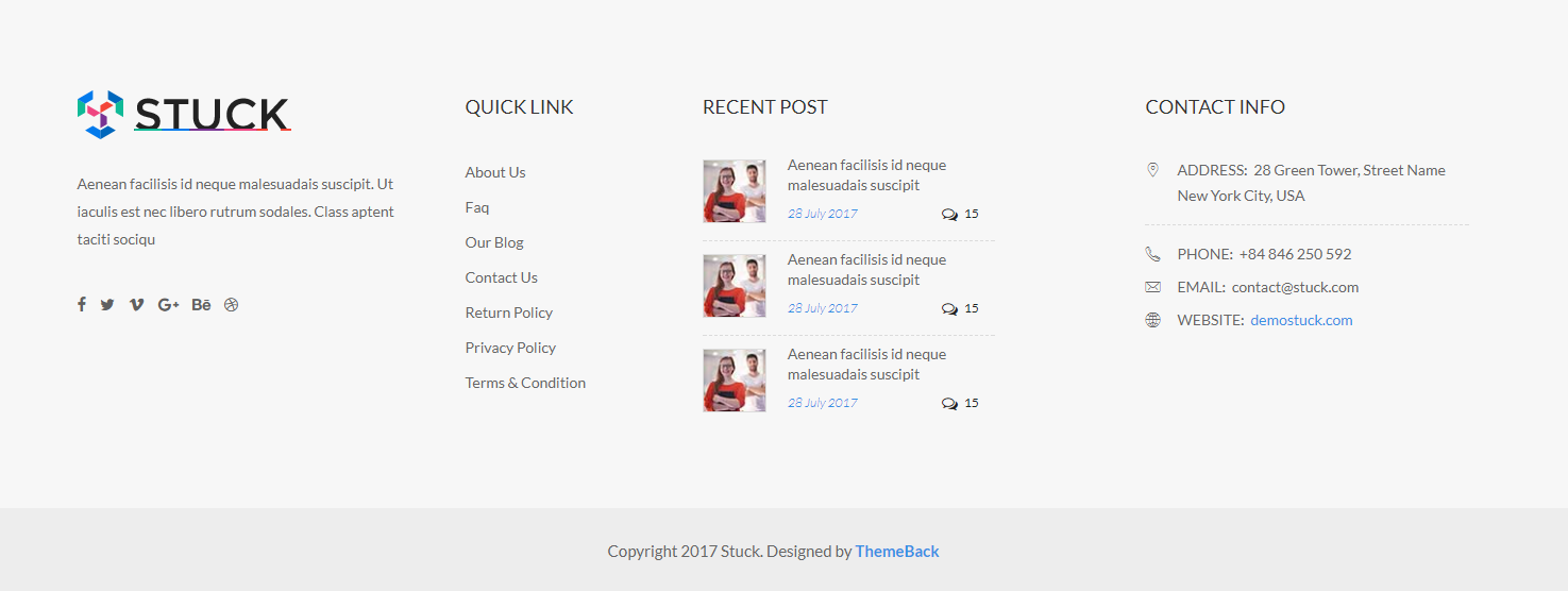
footer
For Footer style you have to include footer.cssfile. You have to use whole css file. You can remove unnecessary css code. We made css style, section by section individual that are well comented (you will better understand if you see code).
For the dark version of footer you just add the .darkclass in the footer tag and also add in the section tag.Note: Responsive Style sheet included in this css file
Example :
Code :
    <footer class="footer_widget3 footer_widget10">
        <div class="footer_widget_area pt_85 pb_60">
            <div class="container-fluid">
                <div class="row">
                    <div class="col-xl-3 col-lg-3 col-md-6">
                        <div class="single_widget widget1">
                            <div class="single_widget widget1">
                                <img src="images/logo-black.png" class="footer_logo" alt="footer-logo">
                                <p class="widget_txt">your content</p>
                            </div>
                            <ul class="social_connect d_inline mt_35">

                                <li><a href="#" title="Facebook" target="_blank"><i class="fa fa-facebook"></i></a></li>
                                <li><a href="#" title="Twitter" target="_blank"><i class="fa fa-twitter"></i></a></li>
                                <li><a href="#" title="Vimeo" target="_blank"><i class="fa fa-vimeo"></i></a></li>
                                <li><a href="#" title="Google-plus" target="_blank"><i class="fa fa-google-plus"></i></a></li>
                                <li><a href="#" title="Behance" target="_blank"><i class="fa fa-behance"></i></a></li>
                                <li><a href="#" title="Dribbble" target="_blank"><i class="fa fa-dribbble"></i></a></li>

                            </ul>
                        </div>
                    </div>

                    <div class="col-xl-2 col-lg-2 col-md-6">
                        <div class="single_widget widget2 pl_30">
                            <h2 class="title_20 widget_title">Quick link</h2>
                            <ul class="quick_link">
                                <li><a href="#">About Us</a></li>
                                <li><a href="#">Faq</a></li>
                                <li><a href="#">Our Blog</a></li>
                                <li><a href="#">Contact Us</a></li>
                                <li><a href="#">Return Policy</a></li>
                                <li><a href="#">Privacy Policy</a></li>
                                <li><a href="#">Terms & Condition</a></li>
                            </ul>
                        </div>
                    </div>

                    <div class="col-xl-3 col-lg-4 col-md-6">
                        <div class="single_widget widget3 pl_30">
                            <h2 class="title_20 widget_title">recent Post</h2>
                            <div class="twitter_post">
                                <div class="single_tweet pos_relative">
                                    <a href="#"><img src="images/tweet-img.jpg" class="tweet_img" alt="tweet img"></a>
                                    <ul class="twitter_text">
                                        <li><a href="#">Aenean facilisis id neque malesuadais suscipit</a></li>
                                        <li class="post_time">
                                            <span class="date">28 July  2017</span> <span class="comments"><i class="fa fa-comments-o"></i>15</span>
                                        </li>
                                    </ul>
                                </div>

                                <!--tweet-2-->
                                <div class="single_tweet pos_relative">
                                    <a href="#"><img src="images/tweet-img.jpg" class="tweet_img" alt="tweet img"></a>
                                    <ul class="twitter_text">
                                        <li><a href="#">Aenean facilisis id neque malesuadais suscipit</a></li>
                                        <li class="post_time">
                                            <span class="date">28 July  2017</span> <span class="comments"><i class="fa fa-comments-o"></i>15</span>
                                        </li>
                                    </ul>
                                </div>

                                <!--tweet-3-->
                                <div class="single_tweet pos_relative">
                                    <a href="#"><img src="images/tweet-img.jpg" class="tweet_img" alt="tweet img"></a>
                                    <ul class="twitter_text">
                                        <li><a href="#">Aenean facilisis id neque malesuadais suscipit</a></li>
                                        <li class="post_time">
                                            <span class="date">28 July  2017</span> <span class="comments"><i class="fa fa-comments-o"></i>15</span>
                                        </li>
                                    </ul>
                                </div>
                                <!--/single tweet-->
                            </div>
                        </div>
                    </div>

                    <div class="col-xl-3 offset-xl-1 col-lg-3 col-md-6">
                        <div class="single_widget widget4">
                            <h2 class="title_20 widget_title">CONTACT INFO</h2>
                            <div class="contact_address">
                                <p class="address"><i class="flaticon-placeholder"></i><span class="text-uppercase">ADDRESS:</span> 28 Green Tower, Street Name New York City, USA</p>
                                <p class="phone"><i class="flaticon-phone-call"></i><span class="text-uppercase">Phone:</span> +84 846 250 592</p>
                                <p class="email"><i class="flaticon-mail"></i><span class="text-uppercase">Email:</span> contact@stuck.com</p>
                                <p class="web"><i class="flaticon-internet"></i><span class="text-uppercase">WEbsite:</span> <a href="#">demostuck.com</a></p>
                            </div>
                        </div>
                    </div>
                    <!--/col-->
                </div>
            </div>
        </div>
        <p class="copyright text-center">copyright text</p>
    </footer>
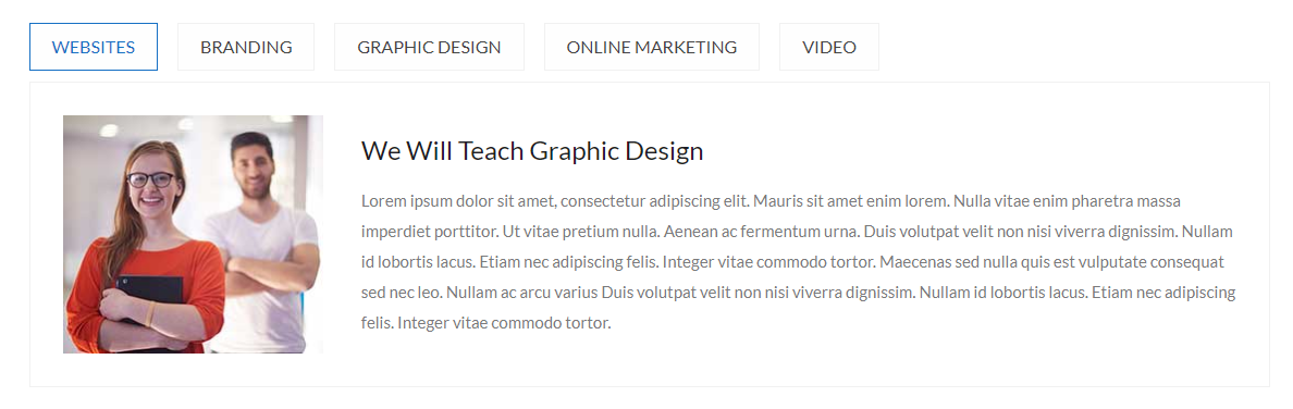
tab
For Tab style you have to include tab.cssfile. You can use whole css file or you can use individual section style. We made css style, section by section individual that are well comented (you will better understand if you see code).Note: Responsive Style sheet included in this css file
Example :
Code :
    <div class="tab_common tab_style1">
        <!-- Nav tabs -->
        <ul class="nav nav-tabs d_inline text-uppercase" role="tablist">
            <li class="nav-item"><a href="#website" class="active" role="tab" data-toggle="tab" aria-selected="true">WEBSITES</a></li>
            <li class="nav-item"><a href="#brand" role="tab" data-toggle="tab" aria-selected="false">BRANDING</a></li>
            <li class="nav-item"><a href="#Gdesign" role="tab" data-toggle="tab" aria-selected="false">GRApHIC DESIGN</a></li>
            <li class="nav-item"><a href="#Omarketing" role="tab" data-toggle="tab" aria-selected="false">ONLINE MARKETING</a></li>
            <li class="nav-item"><a href="#video" role="tab" data-toggle="tab" aria-selected="false">video</a></li>
        </ul>

        <!-- Tab panes -->
        <div class="tab-content">
            <div role="tabpanel" class="fade show tab-pane active" id="website">
                <div class="tab_content align_row_center_left mt_10">
                    <div class="tab_img">
                        <img src="images/tab-img1.jpg" alt="tab img">
                    </div>
                    <div class="tab_text pl_35">
                        <h4 class="color_1e1 pb_15">your title</h4>
                        <p class="color_7a7">your content</p>
                    </div>
                </div>
            </div>

            <!--tab content-2-->
            <div role="tabpanel" class="tab-pane fade" id="brand">
                <div class="tab_content align_row_center_left mt_10">
                    <div class="tab_img">
                        <img src="images/tab-img1.jpg" alt="tab img">
                    </div>
                    <div class="tab_text pl_35">
                        <h4 class="color_1e1 pb_15">your title</h4>
                        <p class="color_7a7">your content</p>
                    </div>
                </div>
            </div>

            <!--tab content-3-->
            <div role="tabpanel" class="tab-pane fade" id="Gdesign">
                <div class="tab_content align_row_center_left mt_10">
                    <div class="tab_img">
                        <img src="images/tab-img1.jpg" alt="tab img">
                    </div>
                    <div class="tab_text pl_35">
                        <h4 class="color_1e1 pb_15">your title</h4>
                        <p class="color_7a7">your content</p>
                    </div>
                </div>
            </div>
            <!--/tab panel-->
        </div>
        <!--/tab content-->
    </div>
    /*----------all Tab Common Style----------*/
    .color_7a7{
        color: #7a7a7b;
    }
    .color_1e1{
        color: #1e1e27;
    }
    .tab_common .nav > li > a:focus,
    .tab_common .nav > li > a:hover {
        background-color: transparent;
        text-decoration: none;
    }
    .tab_common .nav > li > a {
        font-size: 16px;
        text-align: center;
        display: block;
    }
    .tab_common .nav-tabs {
        border-bottom: medium none;
    }

    /*------------------tab style-1------------------*/
    .tab_style1 .nav > li > a {
        background: #fefefe;
        border: 1px solid #f1f1f1;
        color: #444;
        margin-left: 15px;
        padding: 8px 20px;
    }
    .tab_style1 .nav > li > a.active,
    .tab_style1 .nav > li > a:hover {
        border-color: #1670c4;
        color: #1670c4;
    }
    .tab_style1 .nav > li:first-child > a {
        margin-left: 0px;
    }
    .tab_style1 .tab_content {
        border: 1px solid #f1f1f1;
        padding: 30px;
    }
    .tab_style1 .tab_content .tab_img {
        background: #e3e3e3;
        max-width: 240px;
    }
    .tab_style1 .tab_content .tab_text {
        width: 78%;
    }
    .tab_style1 .tab_content .tab_img img {
        width: 100%;
    }
    .tab_style1 .tab_text P {
        line-height: 28px;
    }
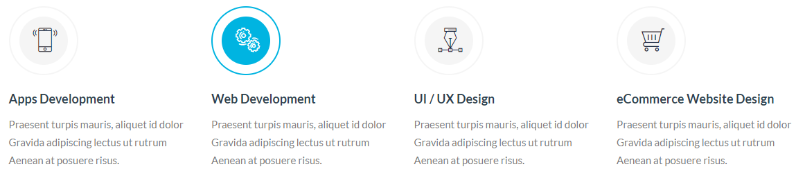
intro-Box
For intro-box style you have to include introBox.cssfile. You can use whole css file or you can use individual section style. We made css style, section by section individual that are well comented (you will better understand if you see code). Note: Responsive Style sheet included in this css file
Example :
Code :
    <section class="welcome_section welcome1">
        <div class="container">
            <div class="row">
                <div class="col-lg-3 col-md-4">
                    <div class="intro_common intro_box1 mb_40">
                        <span class="d_block radius_100p"><i class="flaticon-smartphone-1"></i></span>
                        <div class="intro_text">
                            <h5 class="pt_20 pb_10"><a href="#" class="color_2c3 fw_700">your title</a></h5>
                            <p class="color_7c7">your content</p>
                        </div>
                    </div>
                </div>

                <!--intro-box-2-->
                <div class="col-lg-3 col-md-4">
                    <div class="intro_common intro_box2 mb_40">
                        <span class="d_block radius_100p"><i class="flaticon-gears"></i></span>
                        <div class="intro_text">
                            <h5 class="pt_20 pb_10"><a href="#" class="color_2c3 fw_700">your title</a></h5>
                            <p class="color_7c7">your content</p>
                        </div>
                    </div>
                </div>

                <!--intro-box-3-->
                <div class="col-lg-3 col-md-4">
                    <div class="intro_common intro_box3 mb_40">
                        <span class="d_block radius_100p"><i class="flaticon-pen"></i></span>
                        <div class="intro_text">
                            <h5 class="pt_20 pb_10"><a href="#" class="color_2c3 fw_700">your title</a></h5>
                            <p class="color_7c7">your content</p>
                        </div>
                    </div>
                </div>

                <!--intro-box-4-->
                <div class="col-lg-3 col-md-4">
                    <div class="intro_common intro_box4 mb_40">
                        <span class="d_block radius_100p"><i class="flaticon-shopping-cart-2"></i></span>
                        <div class="intro_text">
                            <h5 class="pt_20 pb_10"><a href="#" class="color_2c3 fw_700">your title</a></h5>
                            <p class="color_7c7">your content</p>
                        </div>
                    </div>
                </div>
                <!--/intro box-->
            </div>
        </div>
    </section>
    /*-------common style for intro section --------*/
    .color_2c3{
        color: #2c3e50;
    }
    .color_7c7{
        color: #7c7c7c;
    }

    /*-----------------intro box / welcome style-1-----------------*/
    .welcome1 .intro_common span{
        height: 100px;
        width: 100px;
        padding: 13px;
        border: 2px solid #f5f5f5;
        position: relative;
        background: #fff;
    }
    .welcome1 .intro_common span i {
        background: #f5f5f5;
        border-radius: 100%;
        color: #1d2b44;
        display: block;
        font-size: 35px;
        height: 70px;
        padding: 20px;
        text-align: center;
        width: 70px;
    }
    .welcome1 .intro_common span::before {
        border-radius: 100%;
        content: "";
        height: 100%;
        left: 0;
        position: absolute;
        top: 0;
        z-index: -1;
        width: 100%;
        border: 2px solid #00b4e1;
    }
    .welcome1 .intro_common:hover span:before {
        -webkit-animation: scaleAnimation1 0.8s 0s;
        -moz-animation: scaleAnimation1 0.8s 0s;
        -ms-animation: scaleAnimation1 0.8s 0s;
        -o-animation: scaleAnimation1 0.8s 0s;
        animation: scaleAnimation1 0.8s 0s;
    }
    .welcome1 .intro_common h5 a:hover {
        color: #00b4e1;
    }
    .welcome1 .intro_common:hover span {
        border-color: #00b4e1;
    }
    .welcome1 .intro_common:hover span i {
        background: #00b4e1;
        color: #fff;
    }


    @-webkit-keyframes scaleAnimation1 {
        0% {
            -webkit-transform: scale(1);
            -moz-transform: scale(1);
            -ms-transform: scale(1);
            -o-transform: scale(1);
            transform: scale(1);
            opacity: 1;
        }
        100% {
            -webkit-transform: scale(1.45);
            -moz-transform: scale(1.45);
            -ms-transform: scale(1.45);
            -o-transform: scale(1.45);
            transform: scale(1.45);
            opacity: 0;
        }
    }
    @keyframes scaleAnimation1 {
        0% {
            -webkit-transform: scale(1);
            -moz-transform: scale(1);
            -ms-transform: scale(1);
            -o-transform: scale(1);
            transform: scale(1);
            opacity: 1;
        }
        100% {
            -webkit-transform: scale(1.45);
            -moz-transform: scale(1.45);
            -ms-transform: scale(1.45);
            -o-transform: scale(1.45);
            transform: scale(1.45);
            opacity: 0;
        }
    }
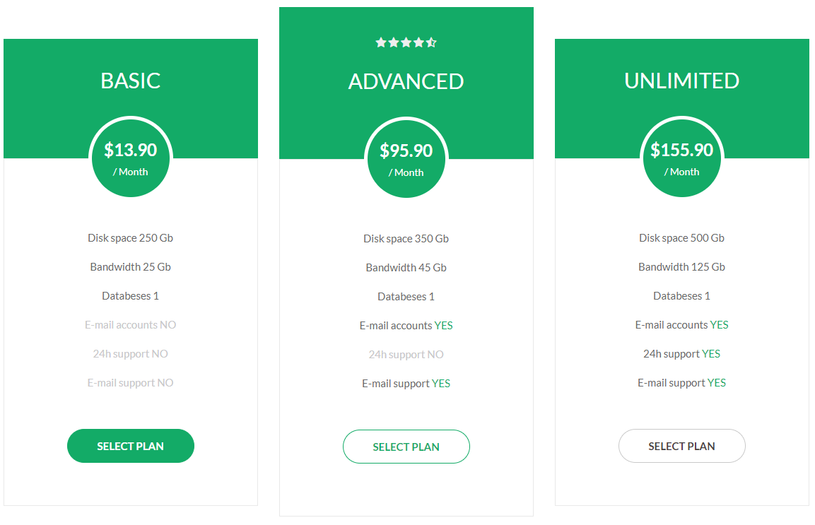
pricing table
For pricing table style you have to include pricingtbl.cssfile. You have to use whole css file. You can remove unnecessary css code. We made css style, section by section individual that are well comented (you will better understand if you see code). Note: Responsive Style sheet included in this css file
Example :
Code :
    <section class="pricingTbl_common pricingTbl1">
        <div class="container">
            <div class="row">
                <div class="col-md-4">
                    <div class="single_tbl">
                        <div class="tbl_header text-center pos_relative">
                            <h3 class="title_35 text-uppercase color_ff">Basic</h3>
                            <div class="price">
                                <h4 class="color_ff fw_700">$13.90</h4>
                                <span class="color_ff b_block">/ Month</span>
                            </div>
                        </div>

                        <div class="tbl_body text-center">
                            <ul>
                                <li>Disk space 250 Gb</li>
                                <li>Bandwidth 25 Gb</li>
                                <li>Databeses 1</li>
                                <li class="dactive_color">E-mail accounts NO</li>
                                <li class="dactive_color">24h support NO</li>
                                <li class="dactive_color">E-mail support NO</li>
                            </ul>
                            <a href="#" class="tbl_btn fw_700 radius_50">SELECT PLAN</a>
                        </div>
                    </div>
                </div>

                <!--table-2-->
                <div class="col-md-4">
                    <div class="single_tbl advanced">
                        <div class="tbl_header text-center pos_relative">
                            <ul class="rating d_inline">
                                <li><i class="fa fa-star"></i></li>
                                <li><i class="fa fa-star"></i></li>
                                <li><i class="fa fa-star"></i></li>
                                <li><i class="fa fa-star"></i></li>
                                <li><i class="fa fa-star-half-o"></i></li>
                            </ul>
                            <h3 class="title_35 text-uppercase color_ff">Advanced</h3>
                            <div class="price">
                                <h4 class="color_ff fw_700">$95.90</h4>
                                <span class="color_ff b_block">/ Month</span>
                            </div>
                        </div>

                        <div class="tbl_body text-center">
                            <ul>
                                <li>Disk space 350 Gb</li>
                                <li>Bandwidth 45 Gb</li>
                                <li>Databeses 1</li>
                                <li>E-mail accounts <span class="active_color">YES</span></li>
                                <li class="dactive_color">24h support NO</li>
                                <li>E-mail support <span class="active_color">YES</span></li>
                            </ul>
                            <a href="#" class="tbl_btn fw_700 radius_50">SELECT PLAN</a>
                        </div>
                    </div>
                </div>

                <!--table-2-->
                <div class="col-md-4">
                    <div class="single_tbl">
                        <div class="tbl_header text-center pos_relative">
                            <h3 class="title_35 text-uppercase color_ff">Unlimited</h3>
                            <div class="price">
                                <h4 class="color_ff fw_700">$155.90</h4>
                                <span class="color_ff b_block">/ Month</span>
                            </div>
                        </div>

                        <div class="tbl_body text-center">
                            <ul>
                                <li>Disk space 500 Gb</li>
                                <li>Bandwidth 125 Gb</li>
                                <li>Databeses 1</li>
                                <li>E-mail accounts <span class="active_color">YES</span></li>
                                <li>24h support <span class="active_color">YES</span></li>
                                <li>E-mail support <span class="active_color">YES</span></li>
                            </ul>
                            <a href="#" class="tbl_btn fw_700 radius_50">SELECT PLAN</a>
                        </div>
                    </div>
                </div>
                <!--/col-->
            </div>
            <!--/row-->
        </div>
    </section>
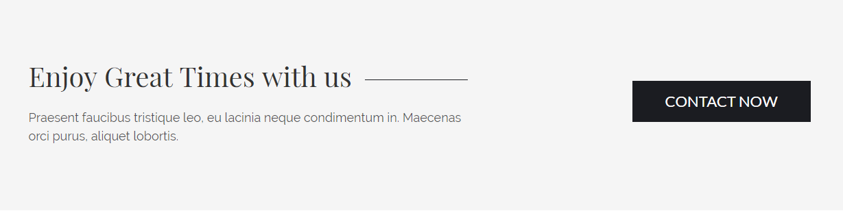
call to action
For call to action style you have to include c2a.cssfile. You can use whole css file or you can use individual section style. We made css style, section by section individual that are well comented (you will better understand if you see code). Note: Responsive Style sheet included in this css file
Example :
Code :
    <section class="cta_common cta1 bg_color_f5f pt_85 pb_95">
        <div class="container">
            <div class="row">
                <div class="col-12">
                    <div class="cta_content align_row_spacebetween">
                        <div class="content_txt">
                            <h2 class="pos_relative playfair">your title</h2>
                            <p class="color_55 raleway pt_20">your content</p>
                        </div>
                        <a href="#" class="cta_button text-uppercase">Contact Now</a>
                    </div>
                </div>
                <!--/col-->
            </div>
        </div>
    </section>
    /*-------common style for c2a section --------*/
    .cta_common .cta_content .content_txt p {
        font-size: 18px;
        line-height: 27px;
    }

    .cta_common .cta_content .cta_button {
      display: inline-block;
      font-size: 18px;
      height: 55px;
      line-height: 54px;
      min-width: 250px;
      text-align: center;
    }

    .cta_common.dark {
        background-color: #1b1c21;
    }

    /*---------style-1-------*/
    .cta1 .cta_content .content_txt {
        max-width: 650px;
    }
    .cta1 .cta_content .content_txt h2::before {
        background: #1b1c21 none repeat scroll 0 0;
        content: "";
        height: 1px;
        position: absolute;
        right: 10px;
        top: 32px;
        width: 150px;
    }
    .cta1 .cta_content .cta_button {
        border: 1px solid #1b1c21;
        background: #1b1c21;
        color: #fff;
    }

    .cta1 .cta_content .cta_button:hover {
        border: 1px solid #1b1c21;
        background: transparent;
        color: #1b1c21;
    }
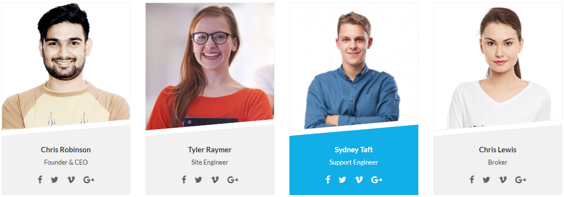
Team
For Team style you have to include owl.carousel.min.cssfile, team.cssfile and owl.carousel.min.jsfile (don't forget to include shortcode-main.js file). You can use whole css file or you can use individual section style. We made css style, section by section individual that are well comented (you will better understand if you see code). Note: Responsive Style sheet included in this css file
Example :
Code :
    <section class="team_section team_style2">
        <div class="container">
            <div class="row">
                <div class="col-lg-3 col-md-6">
                    <div class="team_common">
                        <div class="member_img">
                            <a href="#"><img src="images/team-member5.jpg" alt="member image"></a>
                        </div>
                        <div class="member_info text-center pos_relative">
                            <div class="overlay"></div>
                            <div class="overlay2"></div>
                            <div class="content">
                                <a href="#" class="d_inline fw_600">Chris Robinson</a>
                                <span class="d_block transition_3s">Founder & CEO</span>
                                <ul class="social_contact pt_10">
                                    <li><a href="#" title="Facebook" target="_blank"><i class="fa fa-facebook"></i></a></li>
                                    <li><a href="#" title="Twitter" target="_blank"><i class="fa fa-twitter"></i></a></li>
                                    <li><a href="#" title="Vimeo" target="_blank"><i class="fa fa-vimeo"></i></a></li>
                                    <li><a href="#" title="Google-plus" target="_blank"><i class="fa fa-google-plus"></i></a></li>
                                </ul>
                            </div>
                        </div>
                    </div>
                </div>

                <!--member-2-->
                <div class="col-lg-3 col-md-6">
                    <div class="team_common">
                        <div class="member_img">
                            <a href="#"><img src="images/team-member6.jpg" alt="member image"></a>
                        </div>
                        <div class="member_info text-center pos_relative">
                            <div class="overlay"></div>
                            <div class="overlay2"></div>
                            <div class="content">
                                <a href="#" class="d_inline fw_600">Tyler Raymer</a>
                                <span class="d_block transition_3s">Site Engineer</span>
                                <ul class="social_contact pt_10">
                                    <li><a href="#" title="Facebook" target="_blank"><i class="fa fa-facebook"></i></a></li>
                                    <li><a href="#" title="Twitter" target="_blank"><i class="fa fa-twitter"></i></a></li>
                                    <li><a href="#" title="Vimeo" target="_blank"><i class="fa fa-vimeo"></i></a></li>
                                    <li><a href="#" title="Google-plus" target="_blank"><i class="fa fa-google-plus"></i></a></li>
                                </ul>
                            </div>
                        </div>
                    </div>
                </div>

                <!--member-3-->
                <div class="col-lg-3 col-md-6">
                    <div class="team_common">
                        <div class="member_img">
                            <a href="#"><img src="images/team-member7.jpg" alt="member image"></a>
                        </div>
                        <div class="member_info text-center pos_relative">
                            <div class="overlay"></div>
                            <div class="overlay2"></div>
                            <div class="content">
                                <a href="#" class="d_inline fw_600">Sydney Taft</a>
                                <span class="d_block transition_3s">Support Engineer</span>
                                <ul class="social_contact pt_10">
                                    <li><a href="#" title="Facebook" target="_blank"><i class="fa fa-facebook"></i></a></li>
                                    <li><a href="#" title="Twitter" target="_blank"><i class="fa fa-twitter"></i></a></li>
                                    <li><a href="#" title="Vimeo" target="_blank"><i class="fa fa-vimeo"></i></a></li>
                                    <li><a href="#" title="Google-plus" target="_blank"><i class="fa fa-google-plus"></i></a></li>
                                </ul>
                            </div>
                        </div>
                    </div>
                </div>

                <!--member-4-->
                <div class="col-lg-3 col-md-6">
                    <div class="team_common">
                        <div class="member_img">
                            <a href="#"><img src="images/team-member8.jpg" alt="member image"></a>
                        </div>
                        <div class="member_info text-center pos_relative">
                            <div class="overlay"></div>
                            <div class="overlay2"></div>
                            <div class="content">
                                <a href="#" class="d_inline fw_600">Chris Lewis</a>
                                <span class="d_block transition_3s">Broker</span>
                                <ul class="social_contact pt_10">
                                    <li><a href="#" title="Facebook" target="_blank"><i class="fa fa-facebook"></i></a></li>
                                    <li><a href="#" title="Twitter" target="_blank"><i class="fa fa-twitter"></i></a></li>
                                    <li><a href="#" title="Vimeo" target="_blank"><i class="fa fa-vimeo"></i></a></li>
                                    <li><a href="#" title="Google-plus" target="_blank"><i class="fa fa-google-plus"></i></a></li>
                                </ul>
                            </div>
                        </div>
                    </div>
                </div>
                <!--/col-->
            </div>
        </div>
    </section>
    /*----------Team Common Style----------*/
    .team_common .member_info>a {
        color: #222;
        font-size: 17px;
        line-height: 26px;
    }
    .team_common .member_info span {
        color: #363636;
        font-size: 13px;
    }
    .team_common .member_img img {
        width: 100%;
    }

    /*--------------------team style-2-------------------*/
    .team_style2 .team_common{
        overflow: hidden;
    }
    .team_style2 .member_img {
        border: 1px solid #f1f1f1;
        border-bottom: none;
    }
    .team_style2 .member_info {
        padding-bottom: 18px;
        padding-top: 24px;
    }
    .team_style2 .member_info .content {
        z-index: 9;
        position: relative;
    }

    .team_style2 .team_common:hover .member_info .content>span,
    .team_style2 .team_common:hover .member_info .content a {
        color: #fff;
    }
    .team_style2 .team_common:hover .member_info .content a:hover {
        color: #171718;
    }
    .team_style2 .member_info .overlay2,
    .team_style2 .member_info .overlay{
        height: 140%;
        left: -23px;
        width: 130%;
        z-index: 0;
        -webkit-transform: rotate(-5deg);
        -moz-transform: rotate(-5deg);
        -ms-transform: rotate(-5deg);
        -o-transform: rotate(-5deg);
        transform: rotate(-5deg);
    }

    .team_style2 .member_info .overlay {
        background: #fff none repeat scroll 0 0;
        border-top: 1px solid #f1f1f1;
        top: -14px;
    }
    .team_style2 .member_info .overlay2 {
        background: #f1f1f1 none repeat scroll 0 0;
        top: -3px;
    }
    .team_style2 .team_common:hover .member_info .overlay2 {
        background: #11aee8;
    }
    .team_style2 .member_info .social_contact li {
        display: inline-block;
    }
    .team_style2 .member_info .social_contact li a {
        font-size: 17px;
        padding: 5px 7px;
        color: #606060;
    }
    .team_style2 .team_common:hover .member_info .social_contact li a:hover {
        color: #171718;
    }
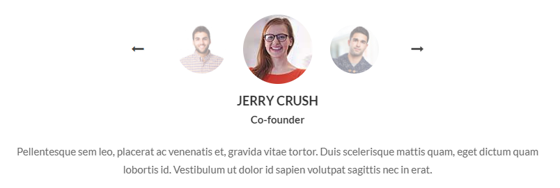
testimoinial
For Testimoinial style you have to include owl.carousel.min.cssfile, slick.css file, testimonial.cssfile, owl.carousel.min.jsfile and slick.js (don't forget to include shortcode-main.js file). You can use whole css file or you can use individual section style. We made css style, section by section individual that are well comented (you will better understand if you see code). Note: Responsive Style sheet included in this css file
Example :
Code :
    <section class="testimonial_common testimonial_style14">
        <div class="container">
            <div class="row">
                <div class="col-lg-8 offset-lg-2">
                    <div class="testimonial_wrapper">
                        <div class="single_testimonial text-center">

                            <div class="testimonial-image-slider align_row_c enter_center slider-nav text-center">
                                <div class="sin-testiImage">
                                    <img src="images/testimonial_author7.jpg">
                                </div>
                                <div class="sin-testiImage">
                                    <img src="images/testimonial_author6.jpg">
                                </div>
                                <div class="sin-testiImage">
                                    <img src="images/testimonial_author5.jpg">
                                </div>
                            </div>
                            <!--/img slider-->

                            <div class="testimonial-text-slider slider-for text-center">
                                <div class="sin-testiText author_info">
                                    <h5 class="text-uppercase color_33 fw_700 pt_5">Jerry Crush</h5>
                                    <span class="color_33 fw_600">Co-founder</span>
                                    <p class="author_comment color_66 pt_20">...</p>
                                </div>
                                <div class="sin-testiText author_info">
                                    <h5 class="text-uppercase color_33 fw_700 pt_5">David gold</h5>
                                    <span class="color_33 fw_600">Co-founder</span>
                                    <p class="author_comment color_66 pt_20">...</p>
                                </div>
                                <div class="sin-testiText author_info">
                                    <h5 class="text-uppercase color_33 fw_700 pt_5">David silver</h5>
                                    <span class="color_33 fw_600">Co-founder</span>
                                    <p class="author_comment color_66 pt_20">...</p>
                                </div>
                            </div>
                            <!--/testimonial-text-slider-->
                        </div>
                        <!--/single_testimonial-->
                    </div>
                    <!--/wrapper-->
                </div>
            </div>
        </div>
    </section>
    /*-----------------------testimonial style-------------*/
    .testimonial_style14 .testimonial-image-slider .slick-track {
        display: flex;
        flex-flow: row;
        align-items: center;
        justify-content: center;
        min-height: 110px;
    }
    .testimonial_style14 .sin-testiImage img {
        border-radius: 50%;
        cursor: pointer;
        display: inline-block !important;
        height: 70px;
        opacity: 0.5;
        width: 70px;
        transition: all 0.5s!important;
    }
    .testimonial_style14 .sin-testiImage.slick-current img {
        height: 100px;
        opacity: 1;
        width: 100px;
    }
    .testimonial_style14 .testimonial-image-slider {
        margin: 0 auto;
        max-width: 350px !important;
    }
    .testimonial_style14 .testimonial-image-slider .slick-arrow {
        color: #474747;
        cursor: pointer;
        font-size: 18px;
        margin-top: -19px;
        padding: 10px 20px;
        position: absolute;
        top: 50%;
    }
    .testimonial_style14 .testimonial-image-slider .slick-arrow:hover {
      color: #027AEC;
    }

    .testimonial_style14 .testimonial-image-slider .slick-arrow.fa-long-arrow-left {
      left: -55px;
    }
    .testimonial_style14 .testimonial-image-slider .slick-arrow.fa-long-arrow-right {
      right: -55px;
    }
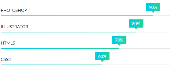
progress bar
For Progress-bar style you have to include progressbar.cssfile and waypoints.min.jsfile (don't forget to include shortcode-main.js file). You can use whole css file or you can use individual section style. We made css style, section by section individual that are well comented (you will better understand if you see code). Note: Responsive Style sheet included in this css file
Example :
Code :
    <div class="skill-progress sm-progress style5">
        <!-- Progressbar 1 -->
        <div class="skill-bar" data-percentage="90%">
            <h4 class="progress-title-holder">
                <span class="progress-title">Photoshop</span>
                <span class="progress-wrapper">
                    <span class="progress-mark"><span class="percent"></span></span>
                </span>
            </h4>
            <div class="progress-outter">
                <div class="progress-content"></div>
            </div>
        </div>

        <!-- Progressbar 2 -->
        <div class="skill-bar" data-percentage="80%">
            <h4 class="progress-title-holder">
                <span class="progress-title">Illustrator</span>
                <span class="progress-wrapper">
                    <span class="progress-mark"><span class="percent"></span></span>
                </span>
            </h4>
            <div class="progress-outter">
                <div class="progress-content"></div>
            </div>
        </div>

        <!-- Progressbar 3 -->
        <div class="skill-bar" data-percentage="70%">
            <h4 class="progress-title-holder">
                <span class="progress-title">Html5</span>
                <span class="progress-wrapper">
                    <span class="progress-mark"><span class="percent"></span></span>
                </span>
            </h4>
            <div class="progress-outter">
                <div class="progress-content"></div>
            </div>
        </div>
    </div>
    <!--/progressbar area-->
    /*----------progressbar Common Style----------*/
    .skill-progress .progress-title-holder {
        position: relative;
        font-size: 14px;
        color: #1e1e27;
        text-transform: uppercase;
    }
    .skill-progress .progress-wrapper {
        width: 100%;
        z-index: 10;
    }
    .skill-progress .progress-mark {
        position: absolute;
        bottom: 0;
        transform: translateX(-50%);
        -ms-transform: translateX(-50%);
        -webkit-transform: translateX(-50%);
    }
    .skill-progress .progress-outter {
        background-color: #e5e5e5;
    }
    .skill-progress .progress-content {
        width: 0%;
        background: #474d53;
    }
    .skill-progress .progress-content,
    .skill-progress .progress-outter {
        height: 20px;
    }
    .skill-progress .percent {
      color: #1e1e27;
      font-size: 14px;
    }

    /*------------------- progress bar --------------------*/
    .style5 .progress-content,
    .style5 .progress-outter {
        height: 2px;
    }
    .style5 .progress-content {
        background: #00cee0;
        background: -moz-linear-gradient(left, #00cee0 23%, #26d28f 100%);
        background: -webkit-linear-gradient(left, #00cee0 23%, #26d28f 100%);
        background: linear-gradient(to right, #00cee0 23%, #26d28f 100%);
        filter: progid:DXImageTransform.Microsoft.gradient( startColorstr='#00cee0', endColorstr='#26d28f', GradientType=1);
    }
    .style5 .skill-bar {
        margin-bottom: 18px;
    }
    .style5 .skill-bar:last-child {
        margin-bottom: 0px;
    }
    .style5 .progress-mark {
        bottom: 10px;
    }
    .style5 .percent {
        background: #00cee0;
        background: -moz-linear-gradient(left, #00cee0 23%, #26d28f 100%);
        background: -webkit-linear-gradient(left, #00cee0 23%, #26d28f 100%);
        background: linear-gradient(to right, #00cee0 23%, #26d28f 100%);
        filter: progid:DXImageTransform.Microsoft.gradient( startColorstr='#00cee0', endColorstr='#26d28f', GradientType=1);
        color: #fff;
        display: inline-block;
        line-height: normal;
        padding: 5px 10px;
        position: relative;
    }
    .style5 .percent:before {
        border-left: 5px solid transparent;
        border-right: 5px solid transparent;
        border-top: 6px solid #26d28f;
        bottom: -6px;
        content: "";
        height: 0;
        left: 50%;
        position: absolute;
        width: 0;
        margin-left: -5px;
    }
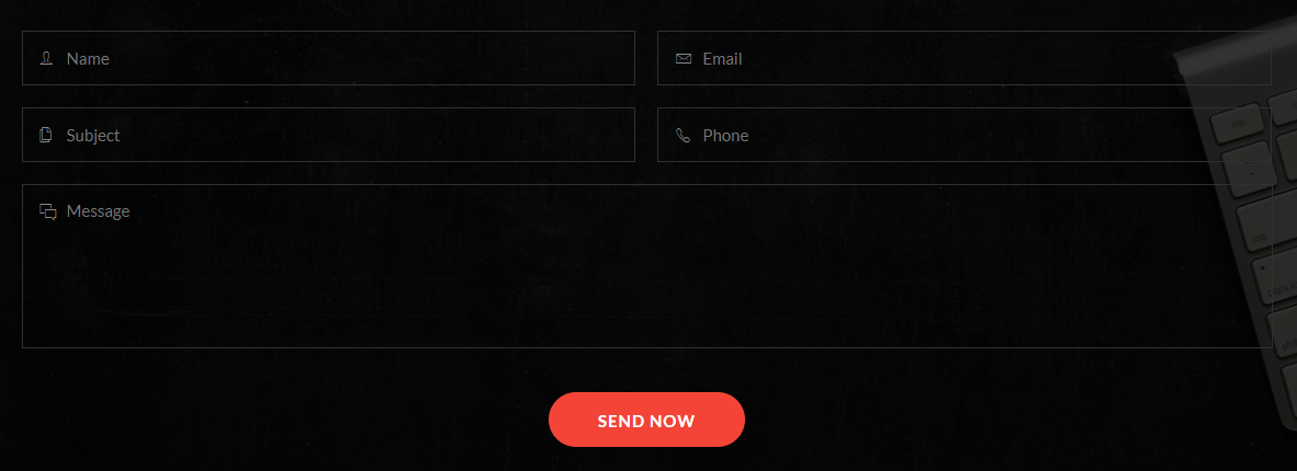
Contact form
For Contact form style you have to include contact-form.cssfile. You can use whole css file or you can use individual section style. We made css style, section by section individual that are well comented (you will better understand if you see code). Note: Responsive Style sheet included in this css file
Example :
Code :
    <section class="contact_form contact_form4 pos_relative">
        <div class="overlay"></div>
        <div class="container">
            <div class="row ">
                <div class="col-12">
                    <h3 class="contact_title color_ff pb_50">Quick Contact Now</h3>
                    <div class="abform_area clearfix">
                        <form action="#" method="post">
                            <div class="abinput_group name float-left">
                                <input type="text" name="name" placeholder="Name">
                            </div>

                            <div class="abinput_group email float-left">
                                <input type="email" name="email" placeholder="Email">
                            </div>

                            <div class="abinput_group subject float-left">
                                <input type="text" name="subject" placeholder="Subject">
                            </div>

                            <div class="abinput_group phone float-left">
                                <input type="tel" name="phone" placeholder="Phone">
                            </div>

                            <div class="abinput_group msg">
                                <textarea name="msg" placeholder="Message"></textarea>
                            </div>
                            <button type="submit" class="text-uppercase fw_700 color_ff d_block radius_50">SEND NOW</button>
                        </form>
                        <!--/form-->
                    </div>
                </div>
            </div>
        </div>
    </section>
    /*------------------------------contact form common style-------------------*/
    .contact_form .abform_area .abinput_group {
        margin-bottom: 20px;
        width: 49.1%;
        position: relative;
        height: 50px;
        background: #fff;
    }
    .contact_form .abform_area .abinput_group.msg{
        width: 100%;
        clear: both;
        height: 150px;
        margin-bottom: 40px;
    }
    .contact_form .abform_area .abinput_group > input {
        border: medium none;
        height: 100%;
        padding: 10px 22px;
        width: 100%;
        background: none;
    }
    .contact_form .abform_area .abinput_group > textarea{
        border: none;
        resize: none;
        width: 100%;
        padding: 10px 22px;
        margin-bottom: 0;
        height: 100%;
        background: none;
    }
    .contact_form .abform_area button{
        border: none;
        height: 50px;
    }

    /*--------------contact form style-4------------------*/
    .contact_form4 {
        background: url(../../images/contact-bg1.jpg) no-repeat center center / cover;
        padding: 90px 0 90px;
    }
    .contact_form4 .overlay{
        background: rgba(0,0,0,0.8);
    }
    .contact_form4 .abform_area .abinput_group:nth-child(even) {
        margin-left: 20px;
    }
    .contact_form4 .abform_area .abinput_group {
        border: 1px solid #303030;
         background: none;
    }
    .contact_form4 .abform_area .abinput_group:before {
        color: #878787;
        font-family: "Ionicons";
        font-size: 18px;
        left: 16px;
        position: absolute;
        top: 11px;
    }
    .contact_form4 .abform_area .abinput_group.name:before{content: "\f47d";}
    .contact_form4 .abform_area .abinput_group.email:before{content: "\f422";}
    .contact_form4 .abform_area .abinput_group.subject:before{content: "\f41b";}
    .contact_form4 .abform_area .abinput_group.phone:before{content: "\f4b8";}
    .contact_form4 .abform_area .abinput_group.msg:before{content: "\f3f9";}

    .contact_form4 .abform_area .abinput_group > textarea,
    .contact_form4 .abform_area .abinput_group > input {
        color: #878787;
        padding-left: 40px;
    }
    .contact_form4 .abform_area .abinput_group.input_effect,
    .contact_form4 .abform_area .abinput_group.input_effect {
        border-color: #b7372d;
    }
    .contact_form4 .abform_area button {
        background: #f44437;
        letter-spacing: 1px;
        margin: 0 auto;
        padding: 2px 45px 0;
    }
    .contact_form4 .abform_area button:hover {
        background: #de2011;
    }
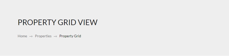
breadcrumbs
For Breadcrumbs style you have to include breadcrumbs.cssfile. You can use whole css file or you can use individual section style. We made css style, section by section individual that are well comented (you will better understand if you see code). Note: Responsive Style sheet included in this css file
Example :
Code :
    <section class="breadcrumbs_common breadcrumbs_style1 bg_color_ee">
        <div class="container">
            <div class="row">
                <div class="col-12">
                    <div class="breadcrumbs_content align_col_center_left">
                        <h3 class="text-uppercase pb_20 color_1b1">Property grid View</h3>
                        <ol class="breadcrumb">
                            <li><a href="#" class="color_77">Home</a></li>
                            <li><a href="#" class="color_77">Properties</a></li>
                            <li class="active">Property Grid</li>
                        </ol>
                    </div>
                </div>
            </div>
        </div>
    </section>
    /*----------Breadcumb Common Style----------*/
    .breadcrumbs_common .breadcrumb {
        background-color: transparent;
        border-radius: 0;
        margin-bottom: 0;
        padding: 0;
    }
    .breadcrumbs_common .breadcrumb > li {
        display: inline-block;
        font-size: 14px;
        padding: 0 14px;
        position: relative;
        text-transform: capitalize;
    }
    .breadcrumbs_common .breadcrumb > li + li::before {
        color: #777;
        content: "\f3d6";
        font-family: "Ionicons";
        font-size: 19px;
        left: -8px;
        line-height: normal;
        padding: 0;
        position: absolute;
        top: 4px;
    }
    .breadcrumbs_common .breadcrumb > li:first-child {
        padding-left: 0;
    }
    .breadcrumbs_common .breadcrumbs_content{
        min-height: 220px;
    }
    .breadcrumbs_common .breadcrumb > .active {
        color: #1b1c21;
    }
    .breadcrumbs_common.bg_img .breadcrumb > .active {
        color: #fff;
    }
    .breadcrumbs_common.bg_img .breadcrumb > li + li::before {
        color: #aeaeae;
    }

    .breadcrumbs_common.bg_img .breadcrumb > li a {
        color: #a5a5a5;
    }
    .breadcrumbs_common.bg_img .breadcrumb > li a:hover {
        color: #a5a5a5;
    }
    .breadcrumbs_common.bg_img .breadcrumbs_content {
        min-height: 320px;
    }
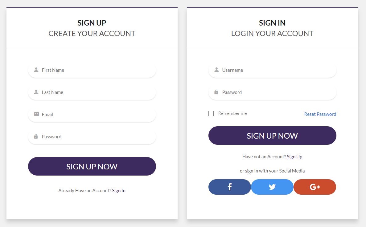
sign-in / Sign-up
For sign-in / sign-up style you have to include signup.cssfile. You can use whole css file or you can use individual section style. We made css style, section by section individual that are well comented (you will better understand if you see code). Note: Responsive Style sheet included in this css file
Example :
Code :
    <section class="signup_form_section2 ptb_120 bg_color_f1f">
        <div class="container">
            <div class="row">
                <div class="col-lg-6">
                    <div class="signup_form_common signup_form2 bg_color_ff">
                        <div class="form_header text-center">
                            <h4 class="fw_700 text-uppercase color_1b1">Sign Up <span class="fw_400 d_block color_55">Create your account</span></h4>
                        </div>
                        <form action="#" method="post">
                            <div class="input_group fname radius_50">
                                <input type="text" name="fname" placeholder="First Name">
                            </div>
                            <div class="input_group lname radius_50">
                                <input type="text" name="lname" placeholder="Last Name">
                            </div>
                            <div class="input_group email radius_50">
                                <input type="email" name="email" placeholder="Email">
                            </div>
                            <div class="input_group password radius_50">
                                <input type="password" name="password" placeholder="Password">
                            </div>
                            <button type="submit" class="transition_3s radius_50 text-uppercase mt_20">Sign Up Now</button>
                            <p class="has_signup text-center color_66 pt_35">Already Have an Account? <a href="#">Sign In</a></p>
                        </form>
                        <!--/form-->
                    </div>
                    <!--/wrapper-->
                </div>

                <div class="col-lg-6">
                    <div class="signup_form_common signup_form2 login bg_color_ff">
                        <div class="form_header text-center">
                            <h4 class="fw_700 text-uppercase color_1b1">Sign in <span class="fw_400 d_block color_55">login your account</span></h4>
                        </div>
                        <form action="#" method="post">
                            <div class="input_group fname radius_50">
                                <input type="text" name="fname" placeholder="Username">
                            </div>
                            <div class="input_group password radius_50">
                                <input type="password" name="password" placeholder="Password">
                            </div>
                            <ul class="remember_pass align_row_spacebetween mb_25 mt_30">
                                <li class="checkbox_common checkbox_style5">
                                    <input name="checkbox5" id="checkbox2" type="checkbox">
                                    <label for="checkbox2"><span></span>Remember me</label>
                                </li>
                                <li><a href="#">Reset Password</a></li>
                            </ul>
                            <button type="submit" class="transition_3s radius_50 text-uppercase">Sign Up Now</button>
                            <p class="has_signup text-center color_66 pt_25 pb_20">Have not an Account? <a href="#">Sign Up</a></p>
                            <!--social login-->
                            <p class="alternative_signin text-center color_66 pb_15">or sign In with your Social Media</p>
                            <ul class="social_login align_row_center_center">
                                <li class="facebook"><a href="#" class="d_block text-center"><i class="fa fa-facebook"></i></a></li>
                                <li class="twitter"><a href="#" class="d_block text-center"><i class="fa fa-twitter"></i></a></li>
                                <li class="google_plus"><a href="#" class="d_block text-center"><i class="fa fa-google-plus"></i></a></li>
                            </ul>
                        </form>
                        <!--/form-->
                    </div>
                    <!--/wrapper-->
                </div>
                <!--/col-->
            </div>
        </div>
    </section>
    /*--------------checkbox common style----------------*/
    .checkbox_common label {
        color: #777777;
        font-size: 15px;
        cursor: pointer;
        font-weight: 300;
    }
    .checkbox_common input[type="checkbox"] {
        display: none;
    }
    .checkbox_common input[type="checkbox"]+label span {
        display: inline-block;
        width: 17px;
        height: 17px;
        margin: -1px 15px 0 0;
        vertical-align: middle;
        cursor: pointer;
        border: 1px solid #777;
        position: relative;
    }

    .checkbox_common input[type="checkbox"]+label span:before {
        color: #777;
        content: "\f00c";
        font-family: "FontAwesome";
        font-size: 9px;
        position: absolute;
        text-align: center;
        left: 3px;
        top: -5px;
        -webkit-transform: scale(0);
        -moz-transform: scale(0);
        -ms-transform: scale(0);
        -o-transform: scale(0);
        transform: scale(0);
        -webkit-transition: 0.2s;
        -moz-transition: 0.2s;
        -ms-transition: 0.2s;
        -o-transition: 0.2s;
        transition: 0.2s;
    }

    .checkbox_common input[type="checkbox"]:checked+label span:before {
        -webkit-transform: scale(1);
        -moz-transform: scale(1);
        -ms-transform: scale(1);
        -o-transform: scale(1);
        transform: scale(1);
    }

    .checkbox_common input[type="checkbox"]+label span,
    .checkbox_common input[type="checkbox"]:checked+label span {
        -webkit-transition: background-color 0.2s linear;
        -o-transition: background-color 0.2s linear;
        -moz-transition: background-color 0.2s linear;
        transition: background-color 0.2s linear;
    }
    .signup_form_common form .remember_pass li a {
      color: #2a79ff;
    }
    .signup_form_common form .remember_pass li a:hover {
      text-decoration: underline;
    }

    /*------social login common--------*/
    .signup_form_common .social_login li{
        flex: 1;
    }
    .signup_form_common .social_login li a {
      color: #fff;
      font-size: 25px;
      height: 60px;
      line-height: 59px;
      padding: 0 15px;
    }
    .signup_form_common .social_login li.facebook a {
        background: #3b5998;
    }
    .signup_form_common .social_login li.twitter a {
        background: #4494f1;
    }
    .signup_form_common .social_login li.google_plus a {
        background: #cb4c2d;
    }

    /*------------------signup and sign in form style-2--------------*/
    .signup_form2 {
        box-shadow: 0 10px 20px rgba(0, 0, 0, 0.15);
        border-top: 2px solid #3d2b5f;
    }
    .signup_form2 .form_header {
        border-bottom: 1px solid #f1f1f1;
        padding: 31px 0;
    }
    .signup_form2 > form {
        padding: 45px 70px 80px;
    }
    .signup_form2 .input_group {
        margin-bottom: 22px;
        box-shadow: 0 2px 3px rgba(0, 0, 0, 0.1);
        padding-left: 15px;
    }
    .signup_form2 .input_group::before {
        left: 20px;
    }
    .signup_form2 form button {
        font-size: 25px;
        color: #fff;
        background: #3d2b5f;
    }
    .signup_form2 form button:hover{
        background: #2b194d;
    }
    .signup_form2 form .has_signup a {
        color: #3d2b5f;
    }
    .signup_form2 form .has_signup a:hover {
        text-decoration: underline;
    }

    .signup_form2 .social_login li a {
      border-radius: 50px;
      font-size: 25px;
      height: 50px;
      line-height: 49px;
    }
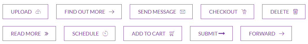
Button style
For Button style you have to include buttons.cssfile. You can use whole css file or you can use individual section style. We made css style, section by section individual that are well comented (you will better understand if you see code).
For the round button you just add the .round class in the ul tag.
Note: Responsive Style sheet included in this css file
Example :
Code :
    <ul class="button_common btn_style1 d_inline">
        <li><a href="#">Upload<i class="flaticon-upload-to-cloud"></i></a></li>
        <li><a href="#">Find Out More<i class="flaticon-arrows-1"></i></a></li>
        <li><a href="#">Send Message<i class="flaticon-mail"></i></a></li>
        <li><a href="#">Checkout<i class="flaticon-shopping-cart-1"></i></a></li>
        <li><a href="#">Delete<i class="flaticon-delete"></i></a></li>
        <li><a href="#">read More<i class="fa fa-angle-double-right"></i></a></li>
        <li><a href="#">Schedule<i class="flaticon-stopwatch"></i></a></li>
        <li><a href="#">Add TO Cart<i class="flaticon-shopping-cart-2"></i></a></li>
        <li><a href="#">Submit<i class="fa fa-long-arrow-right"></i></a></li>
        <li><a href="#">Forward<i class="flaticon-arrows-1"></i></a></li>
    </ul>
    /*----------Button Common Style----------*/
    .button_common {
        margin-left: -25px;
    }
    .button_common > li {
        margin-bottom: 25px;
        margin-left: 25px;
    }
    .button_common li a {
        border: 1px solid #77379f;
        color: #77379f;
        display: block;
        font-size: 18px;
        line-height: 50px;
        padding: 0 45px 0 28px;
        position: relative;
        text-transform: uppercase;
    }
    .button_common li a i {
        overflow: hidden;
    }

    /*---------------btn_style1------------------*/
    .btn_style1 li a i {
        margin-left: 11px;
    }
    .btn_style1 li a i.flaticon-upload-to-cloud:after{
        content: "\f1db";
    }
    .btn_style1 li a i.flaticon-arrows-1:after{
        content: "\f1dd";
    }
    .btn_style1 li a i.flaticon-mail:after{
        content: "\f182";
    }
    .btn_style1 li a i.flaticon-shopping-cart-1:after{
        content: "\f1cd";
    }
    .btn_style1 li a i.flaticon-delete:after{
        content: "\f199";
    }
    .btn_style1 li a i.fa-angle-double-right:after{
         content: "\f101";
    }
    .btn_style1 li a i.flaticon-stopwatch:after{
         content: "\f172";
    }
    .btn_style1 li a i.flaticon-shopping-cart-2:after{
         content: "\f1cc";
    }
    .btn_style1 li a i.fa-long-arrow-right:after{
         content: "\f178";
    }
    .btn_style1 li a i.flaticon-arrows-1:after{
         content: "\f1dd";
    }

    .btn_style1 li a i.fa-long-arrow-right,
    .btn_style1 li a i.fa-angle-double-right {
      font-size: 23px;
      line-height: 50px;
      margin-left: 6px;
    }
    .btn_style1 li a i:after,
    .btn_style1 li a i:before {
        color: #77379f;
        position: absolute;
        right: 25px;
        top: 0;
    }
    .btn_style1 li a i:before{
        opacity: 0;
        visibility: hidden;
    }
    .btn_style1 li a:hover i:before{
        opacity: 1;
        visibility: visible;
    }
    .btn_style1 li a:hover i:after{
        -webkit-animation: animation1 0.5s linear 1 forwards;
        -moz-animation: animation1 0.5s linear 1 forwards;
        -ms-animation: animation1 0.5s linear 1 forwards;
        -o-animation: animation1 0.5s linear 1 forwards;
        animation: animation1 0.5s linear 1 forwards;
    }
    @-webkit-keyframes animation1 {
        from {
            -webkit-transform: translateX(0px) scale(1);
            opacity: 1;
        }
        to {
            -webkit-transform: translateX(10px) scale(2);
            opacity: 0;
        }
    }
    @-moz-keyframes animation1 {
        from {
            -moz-transform: translateX(0px) scale(1);
            opacity: 1;
        }
        to {
            -moz-transform: translateX(10px) scale(2);
            opacity: 0;
        }
    }

    @keyframes animation1 {
        from {
            transform: translateX(0px) scale(1);
            opacity: 1;
        }
        to {
            transform: translateX(10px) scale(2);
            opacity: 0;
        }
    }
newsletter
For newsletter style you have to include subscribe.cssfile. You can use whole css file or you can use individual section style. We made css style, section by section individual that are well comented (you will better understand if you see code).
Note: Responsive Style sheet included in this css file
Example :

Code :
    <section class="newsletter_subscribe subscribe1 pt_60 pb_70">
        <div class="container">
            <div class="row">
                <div class="col-12">
                    <div class="subscribe_title text-center">
                        <h3 class="title_35 text-uppercase color_44">Stay Up to date</h3>
                        <p class="color_66 text-uppercase">Subsribe to Our newsletter</p>
                    </div>
                    <div class="subscribe_form clearfix pt_50">
                        <form action="#">
                            <input type="email" name="email" placeholder="Enter your email" class="float-left">
                            <button type="submit" class="text-uppercase pos_relative float-left"><span>Subscribe</span></button>
                        </form>
                    </div>
                </div>
                <!--/col-->
            </div>
        </div>
    </section>
    /*---------newsletter subscribe common style---------*/
    .newsletter_subscribe .subscribe_form input,
    .newsletter_subscribe .subscribe_form button{
        border: none;
    }
    .newsletter_subscribe .subscribe_form label{
        margin: 0;
    }

    /*----------newsletter subscribe1 style---------*/
    .subscribe1 {
        background: #f7f7f7  url(../../images/newsletter_bg1.png) no-repeat center center / cover;
    }
    .subscribe1 .subscribe_form {
        margin: 0 auto;
        max-width: 760px;
    }
    .subscribe1 .subscribe_form input {
        border-bottom: 1px solid #989898;
        background: transparent;
        height: 45px;
        width: 500px;
        display: block;
        color: #666666;
        padding: 10px 2px;
    }
    .subscribe1 .subscribe_form button {
        border: 1px solid #42bca2;
        background: transparent;
        margin-left: 30px;
    }
    .subscribe1 .subscribe_form button span {
        color: #fff;
        display: block;
        font-size: 18px;
        height: 45px;
        line-height: 44px;
        padding: 0 40px;
        background: #42bca2;
    }
    .subscribe1 .subscribe_form button:hover span {
        transform: translate(-7px, -8px);
    }
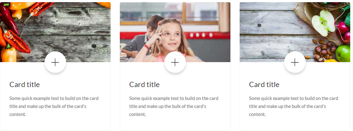
card Style
For Card Style style you have to include card.cssfile. You can use whole css file or you can use individual section style. We made css style, section by section individual that are well comented (you will better understand if you see code).
Note: Responsive Style sheet included in this css file
Example :
Code :
    <section class="card_style card_style1">
        <div class="container">
            <div class="row">
                <div class="col-md-4">
                    <div class="single_card radius_5">
                        <div class="img_area"><a href="#" class="d_block"><img src="images/card-img1.jpg" alt="card img"></a></div>
                        <div class="card_content pos_relative">
                            <span class="puls d_block bg_color_ff text-center radius_100p"><a href="#" class="d_block"><i class="ion-ios-plus-empty"></i></a></span>
                            <h4><a href="#">Card title</a></h4>
                            <p class="color_66 pt_15">...</p>
                        </div>
                    </div>
                </div>

                <!--card-2-->
                <div class="col-md-4">
                    <div class="single_card radius_5">
                        <div class="img_area"><a href="#" class="d_block"><img src="images/card-img2.jpg" alt="card img"></a></div>
                        <div class="card_content pos_relative">
                            <span class="puls d_block bg_color_ff text-center radius_100p"><a href="#" class="d_block"><i class="ion-ios-plus-empty"></i></a></span>
                            <h4><a href="#">Card title</a></h4>
                            <p class="color_66 pt_15">...</p>
                        </div>
                    </div>
                </div>

                <!--card-3-->
                <div class="col-md-4">
                    <div class="single_card radius_5">
                        <div class="img_area"><a href="#" class="d_block"><img src="images/card-img3.jpg" alt="card img"></a></div>
                        <div class="card_content pos_relative">
                            <span class="puls d_block bg_color_ff text-center radius_100p"><a href="#" class="d_block"><i class="ion-ios-plus-empty"></i></a></span>
                            <h4><a href="#">Card title</a></h4>
                            <p class="color_66 pt_15">...</p>
                        </div>
                    </div>
                </div>
                <!--/col-->
            </div>
        </div>
    </section>
    /*--------------card common style--------------*/
    .card_style .single_card .img_area{
        overflow: hidden;
    }
    .card_style .single_card .img_area img {
        width: 100%;
    }
    .card_style .single_card .card_content a {
      color: #333;
    }

    /*--------------card style-1--------------*/
    .card_style1 .single_card .img_area {
        border-radius: 5px 5px 0px 0px;
    }
    .card_style1 .single_card:hover .img_area img{
        -webkit-transform: scale(1.1);
        -moz-transform: scale(1.1);
        -ms-transform: scale(1.1);
        -o-transform: scale(1.1);
        transform: scale(1.1);
    }
    .card_style1 .single_card .card_content {
        border: 1px solid #eee;
        border-top: 0;
        padding: 55px 30px 40px;
        border-radius: 0 0 5px 5px;
    }

    .card_style1 .card_content .puls {
        -webkit-box-shadow: 0 6px 11px rgba(0, 0, 0, 0.17);
        box-shadow: 0 6px 11px rgba(0, 0, 0, 0.17);
        font-size: 50px;
        height: 70px;
        left: 50%;
        margin-left: -35px;
        margin-top: -35px;
        padding: 5px;
        position: absolute;
        top: 0;
        width: 70px;
    }
    .card_style1 .card_content .puls i {
        line-height: normal;
    }
    .card_style1 .card_content .puls:hover i {
        color: #027AEC;
    }
    .card_style1 .single_card .card_content a:hover {
        color: #027AEC;
    }
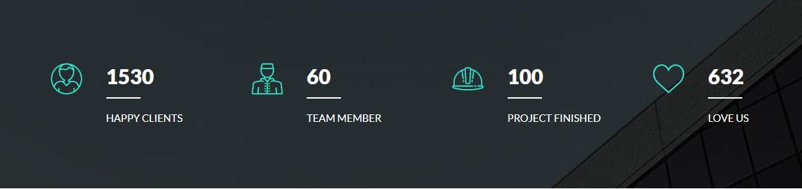
counter
For Counter style you have to include counter.cssfile, waypoints.min.jsfile and jquery.counterup.min.jsfile (don't forget to include shortcode-main.js file). You can use whole css file or you can use individual section style. We made css style, section by section individual that are well comented (you will better understand if you see code). Note: Responsive Style sheet included in this css file
Example :
Code :
    <section class="fun_facts facts1 pos_relative ptb_90">
        <div class="overlay"></div>
        <div class="container">
            <div class="row">
                <div class="col-lg-3 col-md-6">
                    <div class="facts_common pos_relative pl_80">
                        <i class="flaticon-user-4"></i>
                        <h3 class="title_35 fw_900 color_ff counter">1530</h3>
                        <span class="line d_block bg_color_ff mt_10 mb_15"></span>
                        <p class="text-uppercase facts_title color_ff">Happy Clients</p>
                    </div>
                </div>
                <div class="col-lg-3 col-md-6">
                    <div class="facts_common pos_relative pl_80">
                        <i class="flaticon-staff"></i>
                        <h3 class="title_35 fw_900 color_ff counter">60</h3>
                        <span class="line d_block bg_color_ff mt_10 mb_15"></span>
                        <p class="text-uppercase facts_title color_ff">Team Member</p>
                    </div>
                </div>
                <div class="col-lg-3 col-md-6">
                    <div class="facts_common pos_relative pl_80">
                        <i class="flaticon-helmet"></i>
                        <h3 class="title_35 fw_900 color_ff counter">100</h3>
                        <span class="line d_block bg_color_ff mt_10 mb_15"></span>
                        <p class="text-uppercase facts_title color_ff">project Finished</p>
                    </div>
                </div>
                <div class="col-lg-3 col-md-6">
                    <div class="facts_common pos_relative pl_80">
                        <i class="flaticon-like"></i>
                        <h3 class="title_35 fw_900 color_ff counter">632</h3>
                        <span class="line d_block bg_color_ff mt_10 mb_15"></span>
                        <p class="text-uppercase facts_title color_ff">Love Us</p>
                    </div>
                </div>
            </div>
        </div>
    </section>
    /*-------common style for counter section --------*/
    .facts_common .facts_title{
        font-size: 15px;
    }

    /*-------facts style-1 --------*/
    .facts1{
        background: url(../../images/facts-bg1.jpg) no-repeat center center / cover;
    }
    .facts1 .overlay{
        background: rgba(0,0,0,0.8);
    }
    .facts1 .facts_common i {
        color: #31e2cf;
        font-size: 45px;
        line-height: normal;
        position: absolute;
        left: 0;
        top: -2px;
    }
    .facts1 .facts_common span.line {
        height: 2px;
        width: 50px;
    }
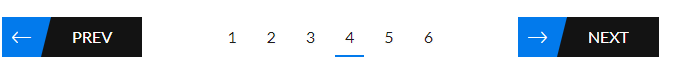
pagination
For Pagination style you have to include pagination.cssfile. You can use whole css file or you can use individual section style. We made css style, section by section individual that are well comented (you will better understand if you see code).
Note: Responsive Style sheet included in this css file
Example :
Code :
    <ul class="pagination_common pagination8 text-center align_row_center_center clearfix">
        <li><a href="#"><i class="ion-ios-arrow-thin-left"></i>prev</a></li>
        <li><a href="#">1</a></li>
        <li><a href="#">2</a></li>
        <li><a href="#">3</a></li>
        <li class="active"><a href="#">4</a></li>
        <li><a href="#">5</a></li>
        <li><a href="#">6</a></li>
        <li><a href="#"><i class="ion-ios-arrow-thin-right"></i>next</a></li>
    </ul>
    /*-------common style for pagination section --------*/
    .bg_efefef {
        background: #efefef;
    }
    .pagination_common {
      width: 100%;
    }
    .pagination_common > li {
      display: inline-block;
    }
    .pagination_common > li a{
        text-align: center;
    }

    /*----------pagination-8-------------*/
    .pagination8 li a {
        color: #1e1e1e;
        display: block;
        font-size: 16px;
        line-height: 40px;
        height: 40px;
        padding: 0 10px;
        position: relative;
        border-bottom: 2px solid transparent;
    }
    .pagination8 li a i {
        background: #027aec;
        color: #fff;
        font-size: 30px;
        left: 0;
        padding: 0px 10px;
        position: absolute;
        top: 0;
        line-height: 40px;
    }
    .pagination8 li a i:after {
        border-right: 10px solid transparent;
        border-top: 40px solid #027aec;
        content: "";
        height: 0;
        position: absolute;
        right: -10px;
        top: 0;
        width: 0;
    }
    .pagination8 > li:first-child {
        margin-right: 70px;
        margin-left: 0;
    }
    .pagination8 > li:last-child {
        margin-left: 70px;
        margin-right: 0;
    }
    .pagination8 li:last-child a,
    .pagination8 li:first-child a {
        font-size: 16px;
        padding: 0 30px 0 70px;
        text-transform: uppercase;
        background: #131313;
        color: #fff;
        border-bottom: none;
    }
    .pagination8 li.active a,
    .pagination8 li a:hover {
        border-bottom-color: #027aec;
    }
    .pagination8 > li {
        float: left;
        margin: 0 5px;
    }
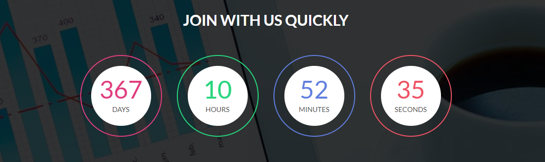
countdown
For Countdown style you have to include countdown.cssfile, waypoints.min.jsfile and jquery.downCount.jsfile (don't forget to include shortcode-main.js file). You can use whole css file or you can use individual section style. We made css style, section by section individual that are well comented (you will better understand if you see code). Note: Responsive Style sheet included in this css file
Example :
Code :
    <section class="countdown countdown3 pos_relative pt_90 pb_100">
        <div class="overlay"></div>
        <div class="container">
            <div class="row">
                <div class="col-xl-8 offset-xl-2 col-lg-10 offset-lg-1">
                    <h3 class="text-uppercase text-center fw_700 color_ff pb_50">Join with us quickly</h3>
                    <div class="countDown countdown_common clearfix">
                        <div class="single-count day ptb_20 radius_100p text-center">
                            <div class="inner_bg bg_color_ff radius_100p">
                                <h1 class="days">40</h1>
                                <p class="days_ref text-uppercase">days</p>
                            </div>
                        </div>
                        <div class="single-count hour ptb_20 radius_100p text-center">
                            <div class="inner_bg bg_color_ff radius_100p">
                                <h1 class="hours">13</h1>
                                <p class="hours_ref text-uppercase">hours</p>
                            </div>
                        </div>
                        <div class="single-count min ptb_20 radius_100p text-center">
                            <div class="inner_bg bg_color_ff radius_100p">
                                <h1 class="minutes">19</h1>
                                <p class="minutes_ref text-uppercase">minutes</p>
                            </div>
                        </div>
                        <div class="single-count second ptb_20 radius_100p text-center">
                            <div class="inner_bg bg_color_ff radius_100p">
                                <h1 class="seconds">32</h1>
                                <p class="seconds_ref text-uppercase">seconds</p>
                            </div>
                        </div>
                    </div>
                    <!--/countdown-->
                </div>
            </div>
        </div>
    </section>
    /*-----------countdown-3--------------*/
    .countdown3{
        background: url(../../images/countdown-bg2.jpg) no-repeat top center / cover;
    }
    .countdown3 .overlay{
        background: rgba(0,0,0,0.8);
    }
    .countdown3 .countDown .single-count {
        float: left;
        margin-left: 30px;
        width: 22%;
        border: 2px solid #fff;
        padding: 20px;
    }
    .countdown3 .countDown .single-count:first-child{
        margin-left: 0;
    }
    .countdown3 .countDown .inner_bg {
        padding: 20px 0;
    }
    .countdown3 .countDown .single-count h1 {
        font-size: 50px;
        line-height: 55px;
    }
    .countdown3 .countDown .single-count p{
        font-size: 14px;
        color: #494949;
    }

    .countdown3 .single-count.day h1{
        color: #e03d7e;
    }
    .countdown3 .single-count.hour h1{
        color: #27d57d;
    }
    .countdown3 .single-count.min h1{
        color: #607edf;
    }
    .countdown3 .single-count.second h1{
        color: #ee5365;
    }

    .countdown3 .single-count.day{
        border-color:#e03d7e;
    }
    .countdown3 .single-count.hour{
        border-color:#27d57d;
    }
    .countdown3 .single-count.min{
        border-color:#607edf;
    }
    .countdown3 .single-count.second{
        border-color:#ee5365;
    }
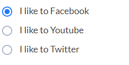
inputs
For Inputs style you have to include inputs.cssfile. For the select box input you hve to use nice-select.css file and jquery.nice-select.min.js file. You can use whole css file or you can use individual section style. We made css style, section by section individual that are well comented (you will better understand if you see code).
Note: Responsive Style sheet included in this css file
Example :
Code :
    <ul class="radio_common radio_style1">
        <li>
            <input type="radio" checked="" name="radio1" id="radio1">
            <label for="radio1"><span></span>I like to Facebook</label>
        </li>

        <li>
            <input type="radio" name="radio1" id="radio2">
            <label for="radio2"><span></span>I like to Youtube</label>
        </li>

        <li>
            <input type="radio" name="radio1" id="radio3">
            <label for="radio3"><span></span>I like to Twitter</label>
        </li>
    </ul>
video section
For Video section style you have to include venobox.cssfile, video-section.cssfile, venobox.min.jsfile and jquery.vide.jsfile (don't forget to include shortcode-main.js file).
If you want background video then you have to use jquery.vide.js file, or if you want popup video then you have to use venobox.min.js file.
You can use whole css file or you can use individual section style. We made css style, section by section individual that are well comented (you will better understand if you see code). Note: Responsive Style sheet included in this css file
Example :

Code :
    <section class="video_section video1 pos_relative">
        <div class="overlay"></div>
        <div class="container">
            <div class="row">
                <div class="col-12">
                    <div class="video_content text-center align_center_center">
                        <span class="line d_block bg_color_ff"></span>
                        <p class="color_ff mt_10">Design trend followed by 2018</p>
                        <h1 class="color_ff pb_50 pt_20">A digital partner to give you better idea for business</h1>
                        <a class="venobox d_inline color_ff radius_100p" data-gall="gall-video" data-autoplay="true" data-vbtype="video" href="https://www.youtube.com/watch?v=u3MY3vIw4Aw"><i class="fa fa-play"></i></a>
                    </div>
                </div>
            </div>
        </div>
    </section>
    /*----------video section Style-1----------*/
    .video1 {
        background: url(../../images/video-bg1.jpg) no-repeat center center / cover;
    }
    .video1 .overlay{
        background: rgba(0,0,0,0.7);
    }
    .video1 .video_content{
        min-height: 500px;
    }
    .video1 .video_content > span.line {
        width: 50px;
        height: 2px;
    }
    .video1 .video_content > p {
        font-size: 18px;
        line-height: 28px;
    }
    .video1 .video_content > h1 {
        max-width: 620px;
        line-height: 60px;
    }
    .video1 .video_content > a.venobox {
        color: #fff;
      border: 2px solid #fff;
      font-size: 22px;
      height: 60px;
      padding: 15px 22px;
      width: 60px;
    }
    .video1 .video_content > a.venobox:hover {
        background: #fff;
        color: #ED2553;
    }
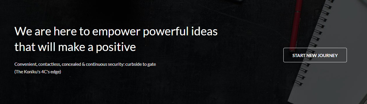
parallax
For parallax style you have to include parallax.cssfile and parallax.jsfile (don't forget to include shortcode-main.js file). You can use whole css file or you can use individual section style. We made css style, section by section individual that are well comented (you will better understand if you see code). Note: Responsive Style sheet included in this css file
Example :
Code :
    <section class="parallax_section parallax2 pos_relative">
        <div class="overlay"></div>
        <div class="container">
            <div class="row">
                <div class="col-12">
                    <div class="parallax_content align_row_spacebetween text-left">
                        <div class="txt">
                            <h2 class="color_ff">your title</h2>
                            <p class="color_ff pt_20 pb_40">...</p>
                        </div>
                        <a href="#" class="readmore fw_700 text-uppercase radius_5">Start new journey</a>
                    </div>
                </div>
            </div>
        </div>
    </section>
    /*----------parallax style-2---------*/
    .parallax2{
        background: url(../../images/parallax-bg2.jpg) no-repeat fixed top center / cover;
    }
    .parallax2 .overlay{
        background: rgba(0,0,0,0.7);
    }
    .parallax2 .parallax_content{
        min-height: 600px;
    }
    .parallax2 .parallax_content .txt {
      max-width: 700px;
    }
    .parallax2 .parallax_content .readmore {
        border: 1px solid #fff;
        color: #fff;
        height: 50px;
        line-height: 50px;
        padding: 0 30px;
    }
    .parallax2 .parallax_content .readmore:hover {
        background: #fff;
        color: #8535a2;
    }
client logo
For Client Logo style you have to include owl.carousel.min.cssfile, client-logo.cssfile and owl.carousel.min.jsfile (don't forget to include shortcode-main.js file). You can use whole css file or you can use individual section style. We made css style, section by section individual that are well comented (you will better understand if you see code). Note: Responsive Style sheet included in this css file
Example :

Code :
    <section class="client_logo client_style1">
        <div class="container">
            <div class="row">
                <div class="col-12">
                    <ul class="logo_wrapper logo_carousel1 owl-carousel">
                        <li><a href="#" class="d_block"><img src="images/client_logo_01.png" alt="client logo"></a></li>
                        <li><a href="#" class="d_block"><img src="images/client_logo_02.png" alt="client logo"></a></li>
                        <li><a href="#" class="d_block"><img src="images/client_logo_03.png" alt="client logo"></a></li>
                        <li><a href="#" class="d_block"><img src="images/client_logo_04.png" alt="client logo"></a></li>
                        <li><a href="#" class="d_block"><img src="images/client_logo_05.png" alt="client logo"></a></li>
                        <li><a href="#" class="d_block"><img src="images/client_logo_06.png" alt="client logo"></a></li>
                        <li><a href="#" class="d_block"><img src="images/client_logo_07.png" alt="client logo"></a></li>
                        <li><a href="#" class="d_block"><img src="images/client_logo_08.png" alt="client logo"></a></li>
                    </ul>
                </div>
            </div>
        </div>
    </section>
    /*-------client-logo-style-1------*/
    .client_logo .logo_wrapper img {
        width: auto;
        margin: 0 auto;
    }
    /*next previous*/
    .logo_carousel1 .owl-prev,
    .logo_carousel1 .owl-next {
        color: #444;
        display: inline-block;
        font-size: 30px;
        height: 40px;
        margin-top: -20px;
        padding: 5px;
        position: absolute;
        text-align: center;
        top: 50%;
        width: 40px;
    }
    .logo_carousel1 .owl-prev{
        left: -40px;
    }
    .logo_carousel1 .owl-next{
        right: -40px;
    }
carousel
For Carousel style you have to include owl.carousel.min.cssfile, carousel.cssfile and owl.carousel.min.jsfile (don't forget to include shortcode-main.js file). You can use whole css file or you can use individual section style. We made css style, section by section individual that are well comented (you will better understand if you see code). Note: Responsive Style sheet included in this css file
Example :
Code :
    <div class="abcarousel_common abcarousel2 owl-carousel">
        <div class="carousel_item">
            <img src="images/carousel-img5.jpg" alt=" carousel img">
        </div>
        <div class="carousel_item">
            <img src="images/carousel-img5.jpg" alt=" carousel img">
        </div>
        <div class="carousel_item">
            <img src="images/carousel-img5.jpg" alt=" carousel img">
        </div>
        <!--/item-->
    </div>
    /*------------carousel style-2-----------*/
    .abcarousel2 .owl-prev,
    .abcarousel2 .owl-next {
        background: rgba(255,255,255,0.5);
        color: #333;
        display: inline-block;
        font-size: 30px;
        height: 40px;
        margin-top: -20px;
        padding: 5px;
        position: absolute;
        text-align: center;
        top: 50%;
        width: 40px;
        opacity: 0;
        visibility: hidden;
    }
    .abcarousel2 .owl-prev{
        left: 0;
    }
    .abcarousel2 .owl-next{
        right: 0;
    }
    .abcarousel2 .owl-prev:hover,
    .abcarousel2 .owl-next:hover{
        background: rgba(255,255,255,1);
    }
    .abcarousel2:hover .owl-prev,
    .abcarousel2:hover .owl-next{
        opacity: 1;
        visibility: visible;
    }
lightbox
For lightbox style you have to include venobox.cssfile, lightbox.cssfile and venobox.min.js file (don't forget to include shortcode-main.js file).
You can use whole css file or you can use individual section style. We made css style, section by section individual that are well comented (you will better understand if you see code). Note: Responsive Style sheet included in this css file
Example :
Code :
    <section class="lightbox_style">
        <div class="container">
            <div class="row">
                <div class="col-md-6">
                    <div class="single_img pos_relative">
                        <img src="images/lightbox-img1.jpg" alt="lightbox img">
                        <div class="hoverlay align_center_center transition_3s">
                            <a data-gall="gallery1" class="venobox vbox-item d_inline" href="images/lightbox-img1.jpg"><i class="flaticon-magnifying-glass"></i></a>
                        </div>
                    </div>
                </div>

                <!--item-2-->
                <div class="col-md-6">
                    <div class="single_img pos_relative">
                        <img src="images/lightbox-img2.jpg" alt="lightbox img">
                        <div class="hoverlay align_center_center transition_3s">
                            <a data-gall="gallery1" class="venobox vbox-item d_inline" href="images/lightbox-img2.jpg"><i class="flaticon-magnifying-glass"></i></a>
                        </div>
                    </div>
                </div>
                <!--/col-->
            </div>
        </div>
    </section>
    .lightbox_style .single_img{
        overflow: hidden;
        margin-bottom: 30px;
    }
    .lightbox_style .single_img img{
        width: 100%;
    }
    .lightbox_style .single_img .hoverlay {
        background: rgba(0, 0, 0, 0.6);
        height: 100%;
        left: 0;
        position: absolute;
        top: 0;
        width: 100%;
        opacity: 0;
        visibility: hidden;
        -webkit-transform: scale(0.4);
        -moz-transform: scale(0.4);
        -ms-transform: scale(0.4);
        -o-transform: scale(0.4);
        transform: scale(0.4);
    }
    .lightbox_style .single_img:hover .hoverlay {
        visibility: visible;
        opacity: 1;
        -webkit-transform: scale(1);
        -moz-transform: scale(1);
        -ms-transform: scale(1);
        -o-transform: scale(1);
        transform: scale(1);
    }
    .lightbox_style .single_img .hoverlay > a {
        background: #fff;
        border-radius: 100%;
        color: #333;
        font-size: 21px;
        height: 35px;
        padding: 5px;
        text-align: center;
        width: 35px;
    }
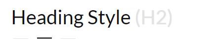
heading style
For Heading Style style you have to include headingStyle.cssfile. For right align style just add the class .right_align and for the center align style just add the class .center_align in the ul tag.
You can use whole css file or you can use individual section style. We made css style, section by section individual that are well comented (you will better understand if you see code). Note: Responsive Style sheet included in this css file
Example :
Code :
    <ul class="heading_common heading_title1">
        <li class="mb_35">
            <h1 class="lato text-capitalize mb_15 color_10">Heading Style <span class="color_e2e">(H1)</span></h1>
            <span class="d_block pos_relative bg_color_44"></span>
        </li>
    </ul>
    /*-----------heading style-1----------*/
    .heading_title1 span.d_block {
      height: 3px;
      margin-left: 52px;
      width: 30px;
    }
    .heading_title1.right_align span.d_block {
        margin-right: 52px;
        margin-left: auto;
    }
    .heading_title1.center_align span.d_block {
        margin: 0 auto;
    }
    .heading_title1 span.d_block::after,
    .heading_title1 .d_block::before {
        background: #e2e2e2;
        content: "";
        height: 1px;
        position: absolute;
        top: 1.5px;
        width: 30px;
    }
    .heading_title1 span.d_block::after {
      right: -48px;
    }
    .heading_title1 span.d_block::before {
      left: -48px;
    }
instagram feed
For Instagram Feed style you have to include instagram-feed.cssfile.
You can use whole css file or you can use individual section style. We made css style, section by section individual that are well comented (you will better understand if you see code). Note: Responsive Style sheet included in this css file
Example :

Code :
    <section class="instagram_feed instagram2">
        <div class="container">
            <div class="row">
                <div class="col-12">
                    <div class="instagram_wrapper clearfix">
                        <div class="single_image pos_relative">
                            <a href="#" title="Click to see more" class="d_block"><img src="images/instagram-img1.jpg" alt="instagram img"></a>
                            <div class="instagram_hoverlay align_center_center transition_3s">
                                <ul class="d_block">
                                    <li><i class="ion-android-favorite-outline"></i><span class="count color_ff d_inline">20</span></li>
                                    <li><i class="ion-ios-chatboxes-outline"></i><span class="count color_ff d_inline">33</span></li>
                                </ul>
                            </div>
                        </div>

                        <!--item-2-->
                        <div class="single_image pos_relative">
                            <a href="#" title="Click to see more" class="d_block"><img src="images/instagram-img2.jpg" alt="instagram img"></a>
                            <div class="instagram_hoverlay align_center_center transition_3s">
                                <ul class="d_block">
                                    <li><i class="ion-android-favorite-outline"></i><span class="count color_ff d_inline">20</span></li>
                                    <li><i class="ion-ios-chatboxes-outline"></i><span class="count color_ff d_inline">33</span></li>
                                </ul>
                            </div>
                        </div>

                        <!--item-3-->
                        <div class="single_image pos_relative">
                            <a href="#" title="Click to see more" class="d_block"><img src="images/instagram-img3.jpg" alt="instagram img"></a>
                            <div class="instagram_hoverlay align_center_center transition_3s">
                                <ul class="d_block">
                                    <li><i class="ion-android-favorite-outline"></i><span class="count color_ff d_inline">20</span></li>
                                    <li><i class="ion-ios-chatboxes-outline"></i><span class="count color_ff d_inline">33</span></li>
                                </ul>
                            </div>
                        </div>

                        <!--item4-->
                        <div class="single_image pos_relative">
                            <a href="#" title="Click to see more" class="d_block"><img src="images/instagram-img4.jpg" alt="instagram img"></a>
                            <div class="instagram_hoverlay align_center_center transition_3s">
                                <ul class="d_block">
                                    <li><i class="ion-android-favorite-outline"></i><span class="count color_ff d_inline">20</span></li>
                                    <li><i class="ion-ios-chatboxes-outline"></i><span class="count color_ff d_inline">33</span></li>
                                </ul>
                            </div>
                        </div>

                        <!--item-5-->
                        <div class="single_image pos_relative">
                            <a href="#" title="Click to see more" class="d_block"><img src="images/instagram-img5.jpg" alt="instagram img"></a>
                            <div class="instagram_hoverlay align_center_center transition_3s">
                                <ul class="d_block">
                                    <li><i class="ion-android-favorite-outline"></i><span class="count color_ff d_inline">20</span></li>
                                    <li><i class="ion-ios-chatboxes-outline"></i><span class="count color_ff d_inline">33</span></li>
                                </ul>
                            </div>
                        </div>

                        <!--item-6-->
                        <div class="single_image pos_relative">
                            <a href="#" title="Click to see more" class="d_block"><img src="images/instagram-img6.jpg" alt="instagram img"></a>
                            <div class="instagram_hoverlay align_center_center transition_3s">
                                <ul class="d_block">
                                    <li><i class="ion-android-favorite-outline"></i><span class="count color_ff d_inline">20</span></li>
                                    <li><i class="ion-ios-chatboxes-outline"></i><span class="count color_ff d_inline">33</span></li>
                                </ul>
                            </div>
                        </div>
                        <!--/item-->
                    </div>
                    <!--/wrapper-->
                </div>
                <!--/col-->
            </div>
        </div>
    </section>
   /*-----------instagram feed style-2--------*/
    .instagram2 .instagram_wrapper{
        margin-left: -15px;
    }
    .instagram2 .single_image {
        float: left;
        margin-bottom: 15px;
        margin-left: 15px;
        width: 15.33%;
        overflow: hidden;
    }
    .instagram2 .single_image img {
        width: 100%;
    }
    .instagram2 .instagram_hoverlay {
        background: rgba(0,0,0,0.7);
        bottom: 0;
        position: absolute;
        width: 45px;
        z-index: 1;
        height: 100%;
        right: -45px;
    }
    .instagram2 .single_image:hover .instagram_hoverlay {
      right: 0px;
    }
    .instagram2 .instagram_hoverlay ul {
        width: 100%;
    }
    .instagram2 .instagram_hoverlay ul li{
        font-size: 20px;
        color: #fff;
        padding: 5px 10px;
        position: relative;
    }
    .instagram2 .instagram_hoverlay ul li:first-child{
        border-right: 1px solid #383838;
    }
    .instagram2 .instagram_hoverlay ul li i{
        vertical-align: middle;
    }
    .instagram2 .instagram_hoverlay ul li span.count {
        background: #ae3cdb;
        border-radius: 100%;
        font-size: 11px;
        line-height: 15px;
        margin-left: 7px;
        padding: 2px 3px;
        position: absolute;
        right: 5px;
        top: 5px;
    }
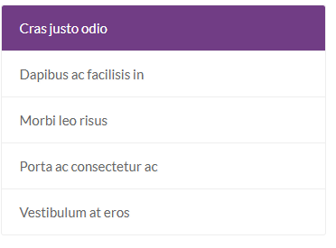
list group
For List Group style you have to include list-group.cssfile. For dark version just add the class .dark in the ul tag.
You can use whole css file or you can use individual section style. We made css style, section by section individual that are well comented (you will better understand if you see code). Note: Responsive Style sheet included in this css file
Example :
Code :
   <ul class="list_common list_style2 radius_3">
        <li class="active"><a href="#">Cras justo odio</a></li>
        <li><a href="#">Dapibus ac facilisis in</a></li>
        <li><a href="#">Morbi leo risus</a></li>
        <li><a href="#">Porta ac consectetur ac</a></li>
        <li><a href="#">Vestibulum at eros</a></li>
    </ul>
   /*--------list group common style--------*/
    .list_common {
        border: 1px solid #eeeeee;
    }
    .list_common.dark {
        border: none;
    }
    .list_common li {
        border-bottom: 1px solid #eeeeee;
    }
    .list_common li:last-child {
        border-bottom: none;
    }
    .list_common li a {
        color: #666666;
        display: block;
        padding: 12px 20px;
    }
    .list_common.dark li {
        border-color: #3c3c3c;
    }
    .list_common.dark li a {
        background: #2b2b2b;
        color: #e1e1e1;
    }
    .list_common li a:hover {
        background: #f8f8f8;
    }
    .list_common.dark li a:hover {
        background: #262626;
    }
    .list_common li:first-child a{
        border-radius: 3px 3px 0 0;
    }
    .list_common li:last-child a{
        border-radius: 0px 0px 3px 3px;
    }

    /*---------list style-2----------*/
    .list_style2.dark li.active a,
    .list_style2 li.active a {
        background: #713d85;
        color: #fff;
    }
    .list_style2.dark li a {
        background: #2f2732;
        color: #fff;
    }
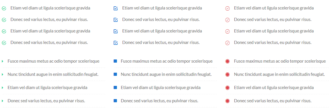
list Style
For List Style style you have to include list_style.cssfile. We made css style, section by section individual that are well comented (you will better understand if you see code). Note: Responsive Style sheet included in this css file
Example :
Code :
   <ul class="list_common list_style1">
        <li><i class="ion-android-checkmark-circle"></i>your title</li>
        <li><i class="ion-android-checkmark-circle"></i>your title</li>
        <li><i class="ion-android-checkmark-circle"></i>your title</li>
        <li><i class="ion-android-checkmark-circle"></i>your title</li>
        <li><i class="ion-android-checkmark-circle"></i>your title</li>
        <li><i class="ion-android-checkmark-circle"></i>your title</li>
    </ul>
   .list_common{
        margin-bottom: 30px;
    }
    .list_common > li {
        color: #777777;
        font-size: 15px;
        line-height: 25px;
        margin-bottom: 15px;
        padding-left: 30px;
        position: relative;
    }
    .list_common > li i {
        font-size: 18px;
        left: 0;
        position: absolute;
        top: 1px;
    }
    .list_common.border_btm > li i {
        top: 10px;
    }
    .list_common.border_btm > li {
        border-bottom: 1px dashed #ececec;
        padding-top: 10px;
        padding-bottom: 10px;
        margin-bottom: 0;
    }
    .list_common.border_solid > li {
        border-bottom-style: solid;
    }
    .list_common.border_btm > li:last-child {
        border-bottom: none;
    }
    /*-----------style-1 ------------*/
    .list_style10 > li i,
    .list_style7 > li i,
    .list_style4 > li i,
    .list_style1 > li i {
        color: #26d28f;
    }
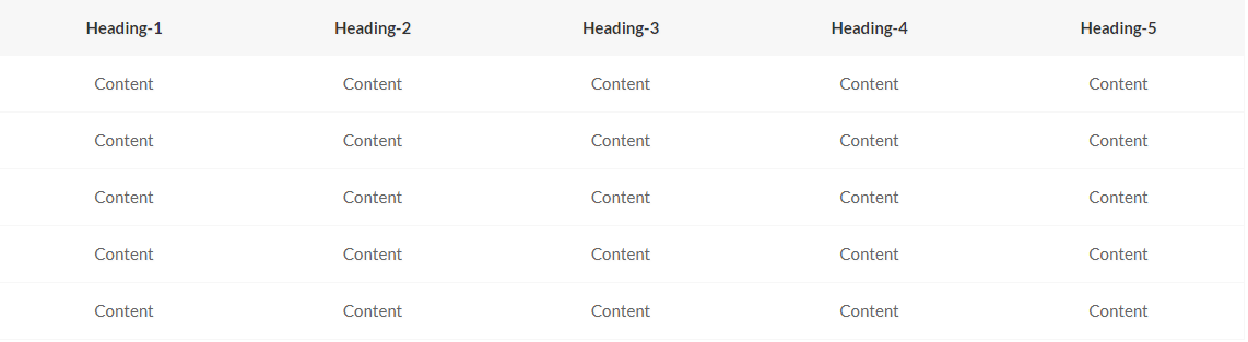
table
For Table style you have to include table.cssfile.
You can use whole css file or you can use individual section style. We made css style, section by section individual that are well comented (you will better understand if you see code). Note: Responsive Style sheet included in this css file
Example :
Code :
   <div class="table-responsive table_style_common table_style4">
        <table class="table">
            <thead>
                <tr>
                    <th>Heading-1</th>
                    <th>Heading-2</th>
                    <th>Heading-3</th>
                    <th>Heading-4</th>
                    <th>Heading-5</th>
                </tr>
            </thead>
            <tbody>
                <tr>
                    <td>Content</td>
                    <td>Content</td>
                    <td>Content</td>
                    <td>Content</td>
                    <td>Content</td>
                </tr>
                <tr>
                    <td>Content</td>
                    <td>Content</td>
                    <td>Content</td>
                    <td>Content</td>
                    <td>Content</td>
                </tr>
                <tr>
                    <td>Content</td>
                    <td>Content</td>
                    <td>Content</td>
                    <td>Content</td>
                    <td>Content</td>
                </tr>
                <tr>
                    <td>Content</td>
                    <td>Content</td>
                    <td>Content</td>
                    <td>Content</td>
                    <td>Content</td>
                </tr>
                <tr>
                    <td>Content</td>
                    <td>Content</td>
                    <td>Content</td>
                    <td>Content</td>
                    <td>Content</td>
                </tr>
            </tbody>
        </table>
    </div>
   /*-------table common style-------*/
    .table_style_common table tr > th,
    .table_style_common table tr > td {
        color: #666666;
        padding: 15px 10px !important;
        text-align: center;
        border: none;
        background: #f9f9f9;
    }
    .table_style_common table tr > th {
        color: #333333;
        background: #f1f0f0;
    }
    .table_style_common .table > thead > tr > th {
        border: none;
    }
    .table_style_common table tr:hover td{
        background: #fff;
    }

    /*-------table style-4------*/
    .table_style4 table{
        border: 1px solid #f7f7f7;
    }
    .table_style4 table tr > th{
        background: #f7f7f7;
    }
    .table_style4 table tr > td{
        background: none;
        border-bottom: 1px solid #f7f7f7;
    }
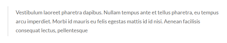
blockquotes
For blockquotes style you have to include blockquotes.cssfile.
You can use whole css file or you can use individual section style. We made css style, section by section individual that are well comented (you will better understand if you see code). Note: Responsive Style sheet included in this css file
Example :
Code :
   <blockquote class="blockquotes_common">
        <p class="color_66">your content</p>
    </blockquote>
   /*--------blockquotes common style--------*/
    blockquote.blockquotes_common {
        border-left: 3px solid #e9e9e9;
        padding: 5px 25px;
    }
    blockquote.blockquote_reverse {
        border-right: 3px solid #e9e9e9;
        border-left: none;
        text-align: right;
    }
    blockquote.blockquotes_common p {
        font-size: 18px;
        line-height: 30px;
    }
alert
For alert style you have to include alert.cssfile.
You can use whole css file or you can use individual section style. We made css style, section by section individual that are well comented (you will better understand if you see code). Note: Responsive Style sheet included in this css file
Example :
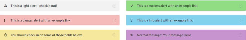
Code :
    <div class="alert_common alert1 pos_relative alert alert-dismissible fade show" role="alert">
        <button type="button" class="close" data-dismiss="alert" aria-label="Close"><span aria-hidden="true"><i class="ion-ios-close-outline"></i></span></button>
        <p class="color_55 pl_30 fw_700 lato pos_relative"><i class="ion-alert-circled"></i>This is a light alert—check it out! </p>
    </div>

    <!--alert-2-->
    <div class="alert_common alert2 pos_relative alert alert-dismissible fade show" role="alert">
        <button type="button" class="close" data-dismiss="alert" aria-label="Close"><span aria-hidden="true"><i class="ion-ios-close-outline"></i></span></button>
        <p class="color_55 pl_30 fw_700 lato pos_relative"><i class="ion-alert"></i>This is a danger alert with an example link</p>
    </div>

    <!--alert-3-->
    <div class="alert_common alert3 pos_relative alert alert-dismissible fade show" role="alert">
        <button type="button" class="close" data-dismiss="alert" aria-label="Close"><span aria-hidden="true"><i class="ion-ios-close-outline"></i></span></button>
        <p class="color_55 pl_30 fw_700 lato pos_relative"><i class="ion-android-stopwatch"></i>You should check in on some of those fields below. </p>
    </div>

    <!--alert-4-->
    <div class="alert_common alert4 pos_relative alert alert-dismissible fade show" role="alert">
        <button type="button" class="close" data-dismiss="alert" aria-label="Close"><span aria-hidden="true"><i class="ion-ios-close-outline"></i></span></button>
        <p class="color_55 pl_30 fw_700 lato pos_relative"><i class="ion-checkmark"></i> This is a success alert with an example link.</p>
    </div>

    <!--alert-2-->
    <div class="alert_common alert5 pos_relative alert alert-dismissible fade show" role="alert">
        <button type="button" class="close" data-dismiss="alert" aria-label="Close"><span aria-hidden="true"><i class="ion-ios-close-outline"></i></span></button>
        <p class="color_55 pl_30 fw_700 lato pos_relative"><i class="ion-ios-lightbulb-outline"></i> This is a info alert with an example link. </p>
    </div>

    <!--alert-3-->
    <div class="alert_common alert6 pos_relative alert alert-dismissible fade show" role="alert">
        <button type="button" class="close" data-dismiss="alert" aria-label="Close"><span aria-hidden="true"><i class="ion-ios-close-outline"></i></span></button>
        <p class="color_55 pl_30 fw_700 lato pos_relative"><i class="ion-android-volume-up"></i>Normal Message! Your Message Here</p>
    </div>
    <!--/alert-->
   /*----common style for alert section -----*/
    .alert_common.alert {
        border-radius: 3px;
        padding: 10px 35px 10px 20px;
    }
    .alert_common .close {
        margin-top: -10px;
        position: absolute;
        right: 15px;
        top: 50%;
    }
    .alert_common p i {
        font-size: 16px;
        left: 0;
        position: absolute;
        top: 50%;
        transform: translateY(-50%);
    }
    .alert1 {
        background: #f2f2f2;
    }
    .alert2 {
        background: #f5bbbb;
    }
    .alert3 {
        background: #f6e89d;
    }
    .alert4 {
        background: #90dd84;
    }
    .alert5 {
        background: #82d2ed;
    }
    .alert6 {
        background: #c794d0;
    }
label & badge
For label & badge style you have to include label&badge.cssfile.
You can use whole css file or you can use individual section style. We made css style, section by section individual that are well comented (you will better understand if you see code). Note: Responsive Style sheet included in this css file
Example :
Code :
    <ul class="badge_style align_row_center_left">
        <li class="badge_style1 text-center">
            <p class="icon pos_relative d_inline"><i class="ion-android-notifications-none"></i><span class="count">99</span></p>
            <p class="txt color_33">Notification</p>
        </li>
    </ul>
   .badge_style li{
        margin-right: 50px;
    }
    .badge_style li:last-child {
        margin-right: 0px;
    }

    /*------badge style-1-----*/
    .badge_style1 .icon i {
      color: #555555;
      font-size: 50px;
    }
    .badge_style1 .icon .count {
        background: #f44437;
        border-radius: 50px;
        color: #fff;
        display: inline-block;
        font-size: 13px;
        line-height: 10px;
        min-height: 23px;
        min-width: 23px;
        padding: 6px 4px;
        position: absolute;
        right: -10px;
        top: -5px;
    }
    .badge_style1 .txt.color_33 {
        font-size: 20px;
        margin-top: 2px;
    }
Modal
For Modal style you have to include modal.cssfile.
You can use whole css file or you can use individual section style. We made css style, section by section individual that are well comented (you will better understand if you see code). Note: Responsive Style sheet included in this css file
Code :
<div class="modal fade ABmodal_transition ABmodal_slideTop ABmodal_common" tabindex="-1" role="dialog"> <div class="modal-dialog" role="document"> <div class="modal-content"> <button type="button" class="close" data-dismiss="modal" aria-label="Close"><span aria-hidden="true">×</span></button> <!--content start--> modal content <!--content end--> </div> </div> </div>
    /*--------------modal common style------------------*/
    .ABmodal_common button.close {
        background: #fff;
        opacity: 1;
        position: absolute;
        border-radius: 100%;
        height: 30px;
        width: 30px;
        right: -12px;
        top: -12px;
    }
    .ABmodal_common button.close i {
        display: block;
        font-size: 15px;
    }
    .ABmodal_common.fade .modal-dialog {
      -webkit-transform: translate(0px, 0px);
      -moz-transform: translate(0px, 0px);
      -ms-transform: translate(0px, 0px);
      -o-transform: translate(0px, 0px);
      transform: translate(0px, 0px);
    }
    .ABmodal_transition.fade .modal-dialog {
        -webkit-transition: all .5s ease-out;
        -moz-transition: all .5s ease-out;
        -ms-transition: all .5s ease-out;
        -o-transition: all .5s ease-out;
        transition: all .5s ease-out;
    }

    /*--------modal slide top ----------*/
    .ABmodal_slideTop.fade .modal-dialog {
        -webkit-transform: translate(0px, -25%);
        -moz-transform: translate(0px, -25%);
        -ms-transform: translate(0px, -25%);
        -o-transform: translate(0px, -25%);
        transform: translate(0px, -25%);
        visibility: hidden;
        opacity: 0;
    }
    .ABmodal_slideTop.fade.show .modal-dialog {
        -webkit-transform: translate(0, 0px);
        -moz-transform: translate(0, 0px);
        -ms-transform: translate(0, 0px);
        -o-transform: translate(0, 0px);
        transform: translate(0, 0px);
        visibility: visible;
        opacity: 1;
    }
Helper Classes
   /*----color classes------*/
   .color_22 = color:#222222;
   .color_33 = color:#333333;
   .color_55 = color:#555555;
   .color_66 = color:#666666;
   .color_77 = color:#777777;
   .color_88 = color:#888888;
   .color_ff = color:#ffffff;
   .color_00 = color:#000000;
   .color_10 = color:#101010;
   .color_dd = color:#dddddd;
   .color_ee = color:#eeeeee;
   .color_44 = color:#444444;
   .color_ae = color:#aeaeae;
   .color_af5 = color:#af52ca;
   .color_2fc = color:#2fc4c0;
   .color_1ed = color:#1ed798;
   .color_724 = color:#724bde;
   .color_ef4 = color:#ef4581;
   .color_027 = color:#027aec;
   .color_7a5 = color:#7a57db;
   .color_984 = color:#984059;
   .color_dc3 = color:#dc3840;
   .color_18a = color:#18a9d9;
   .color_2f6 = color:#2f61b2;
   .color_247 = color:#2474ce;
   .color_00b = color:#00b4e1;
   .color_0fb = color:#0fba97;
   .color_1c1 = color:#1c1f2e;
   .color_151 = color:#15131b;
   .color_9dc = color:#9dce45;
   .color_f7 =	color:#f7f7f7;
   .color_26d = color:#26d28f;
   .color_fbf = color:#fbfbfb;
   .color_15d = color:#15ddd6;
   .color_ffe = color:#ffeb3b;
   .color_34e = color:#34eec8;
   .color_e5e = color:#e5e5e5;
   .color_1b1 = color:#1b1c21;
   .color_e2e = color:#e2e2e2;
   /*------background color classes-------*/
  .bg_color_22 = background-color: #222222;
  .bg_color_33 = background-color: #333333;
  .bg_color_55 = background-color: #555555;
  .bg_color_ff = background-color: #ffffff;
  .bg_color_00 = background-color: #000000;
  .bg_color_10 = background-color: #101010;
  .bg_color_dd = background-color: #dddddd;
  .bg_color_ee = background-color: #eeeeee;
  .bg_color_44 = background-color: #444444;
  .bg_color_ae = background-color: #aeaeae;
  .bg_color_af5 = background-color: #af52ca;
  .bg_color_2fc = background-color: #2fc4c0;
  .bg_color_1ed = background-color: #1ed798;
  .bg_color_724 = background-color: #724bde;
  .bg_color_ef4 = background-color: #ef4581;
  .bg_color_027 = background-color: #027aec;
  .bg_color_7a5 = background-color: #7a57db;
  .bg_color_984 = background-color: #984059;
  .bg_color_dc3 = background-color: #dc3840;
  .bg_color_18a = background-color: #18a9d9;
  .bg_color_2f6 = background-color: #2f61b2;
  .bg_color_247 = background-color: #2474ce;
  .bg_color_00b = background-color: #00b4e1;
  .bg_color_0fb = background-color: #0fba97;
  .bg_color_1c1 = background-color: #1c1f2e;
  .bg_color_151 = background-color: #15131b;
  .bg_color_9dc = background-color: #9dce45;
  .bg_color_f7 = background-color: #f7f7f7;
  .bg_color_26d = background-color: #26d28f;
  .bg_color_f4f = background-color: #f4f4f4;
  .bg_color_fbf = background-color: #fbfbfb;
  .bg_color_15d = background-color: #15ddd6;
  .bg_color_ffe = background-color: #ffeb3b;
  .bg_color_34e = background-color: #34eec8;
  .bg_color_f5f = background-color: #f5f5f5;
  .bg_color_f8f = background-color: #f8f8f8;
  .bg_color_f1f = background-color: #f1f1f1;
  .bg_color_f7f = background-color: #f7f7f7;
   /*-------font wight---------*/
   .fw_300 = font-weight: 300;
   .fw_400 = font-weight: 400;
   .fw_500 = font-weight: 500;
   .fw_600 = font-weight: 600;
   .fw_700 = font-weight: 700;
   .fw_900 = font-weight: 900;

   /*----font family classes------*/
   .raleway = font-family: 'Raleway', sans-serif;
   .lato = font-family: 'Lato', sans-serif;
   .roboto = font-family: 'Roboto', sans-serif;
   .playfair = font-family: 'Playfair Display', serif;
   .mont = font-family: 'Montserrat', sans-serif;
   .merriweather = font-family: 'Merriweather', serif;

   /*---------border-radius-------*/
   .radius_3 = border-radius: 3px;
   .radius_5 = border-radius: 5px;
   .radius_10 = border-radius: 10px;
   .radius_50 = border-radius: 50px;
   .radius_100p = border-radius: 100%;

   /*---------transition-------*/
   .transition_3s = transition: all 0.3s ease;
   .transition_4s = transition: all 0.3s linear;
   .transition_5s = transition: all 0.5s linear;

   /*-------other classes--------*/
   .pos_relative = position: relative;
   .d_block = display: block;

   /*-------flex classes--------*/
   .align_center_center
   .align_col_center_left
   .align_col_bottom_left
   .align_col_center_right
   .align_col_right_bottom
   .align_col_center_bottom
   .align_row_left_top
   .align_row_center_left
   .align_row_center_right
   .align_row_center_center
   .align_row_spacebetween
Sources & Credits
- Ioicon
- Flaticon
- Themify Icon
- FontAwesome
Font Icons
- Lato
- Roboto
- Raleway
- Montserrat
- Merriweather
- Playfari Display
Fonts Family
- jQuery Library
- Animated CSS
- Slick Slider
- Nice Select
- Owl Carousel
- Venobox
- Counter js
- Vide Js
Plugins
- Bootstrap v4.0.0
Freamwork
Supports
Thank you for reading the documentaion. If you still have any question or any problem, please contact with us. We will give you best support. Thanks.
Theme Back
social icon
For Social Icon style you have to include
social-icon.cssfile.You can use whole css file or you can use individual section style. We made css style, section by section individual that are well comented (you will better understand if you see code).
Note:Responsive Style sheet included in this css fileExample :
Code :